

Edited by Robert Beach
Welcome back to my bi-weekly Saturday cover showcase. We’ll see if I’m committed enough to eventually give it less of a mouthful of a name. Sorry, September has been such a sketchy month for blog posts; hopefully, that will turn around in the latter half of the month, but I make no promises. You can still find my weekly work on All-Comic and Front Towards Gamer, and I’ll still be getting pieces out like this one.
With that little bit of housekeeping out of the way, Godzilla, where to begin? In case you’ve somehow avoided one of the largest figures in nerd culture, Godzilla is a giant monster lizard who birthed the Kaiju subgenre of Sci-Fi/Horror films. He’s been around for over 50 years, is the King of the Monsters, and is incredibly awesome. Godzilla’s also appeared on numerous comic covers over the years, and this Saturday we honor him.

 10.
10.
Welcome back to my bi-weekly Saturday cover showcase. We’ll see if I’m committed enough to eventually give it less of a mouthful of a name. Sorry, September has been such a sketchy month for blog posts; hopefully, that will turn around in the latter half of the month, but I make no promises. You can still find my weekly work on All-Comic and Front Towards Gamer, and I’ll still be getting pieces out like this one.
With that little bit of housekeeping out of the way, Godzilla, where to begin? In case you’ve somehow avoided one of the largest figures in nerd culture, Godzilla is a giant monster lizard who birthed the Kaiju subgenre of Sci-Fi/Horror films. He’s been around for over 50 years, is the King of the Monsters, and is incredibly awesome. Godzilla’s also appeared on numerous comic covers over the years, and this Saturday we honor him.


A good chunk of these covers will come from the comic run Godzilla King of the Monsters. Godzilla King of the Monsters was a Marvel adaptation comic published in the late ‘70s, my favorite era of comic books. This was around the time Marvel started aggressively expanding their brand presence; shoveling out live-action adaptation of their properties, they also bought up the adaptation license to all kinds of other franchises.
Godzilla King of the Monsters was one of their more major landings, especially given they chose to integrate Godzilla into the Marvel canon, but we’ll come back to that. I really like this cover, for how much it embraces the weirdness of both Godzilla and comic books. There’s a bit of a revisionist slant towards Godzilla in the ‘70s, with a lot of modern fans and adaptations just glossing over that era, yet I like that Marvel decided to dive in head first. I especially like the way the rat looks every bit as ferocious as Godzilla in this cover.
 9.
9.
Godzilla King of the Monsters was one of their more major landings, especially given they chose to integrate Godzilla into the Marvel canon, but we’ll come back to that. I really like this cover, for how much it embraces the weirdness of both Godzilla and comic books. There’s a bit of a revisionist slant towards Godzilla in the ‘70s, with a lot of modern fans and adaptations just glossing over that era, yet I like that Marvel decided to dive in head first. I especially like the way the rat looks every bit as ferocious as Godzilla in this cover.

Of course, you can’t make Godzilla without giving him an enemy to fight. Marvel didn’t actually have the rights to any of Toho’s other monsters. To get around this, they had Godzilla fight their own in-house Kaijus while also developing the giant-sized hero Red Ronin to combat him. Red Ronin is the most capable human foe Godzilla has ever faced, and this cover perfectly shows off why. He’s not only shrugging off Godzilla’s nuclear breath here, but he’s slamming the king of the monsters right in the chest.
I especially like the nonsensical foreshortening of Godzilla somehow demolishing a nearby building with his tale. \All things considered I’m surprised Red Ronin hasn’t appeared in more comics after this. He’s a fun character, a young kid inside a giant robo-samurai armor. Given the fact that comics care about diversity, now he could stand for a revival. Herb Trimpe did all of this Godzilla King of the Monsters cover art. Herb was a real talent and, along with Don Heck, is one of the most influential and under-appreciated Marvel artists.
 8.
8.
I especially like the nonsensical foreshortening of Godzilla somehow demolishing a nearby building with his tale. \All things considered I’m surprised Red Ronin hasn’t appeared in more comics after this. He’s a fun character, a young kid inside a giant robo-samurai armor. Given the fact that comics care about diversity, now he could stand for a revival. Herb Trimpe did all of this Godzilla King of the Monsters cover art. Herb was a real talent and, along with Don Heck, is one of the most influential and under-appreciated Marvel artists.
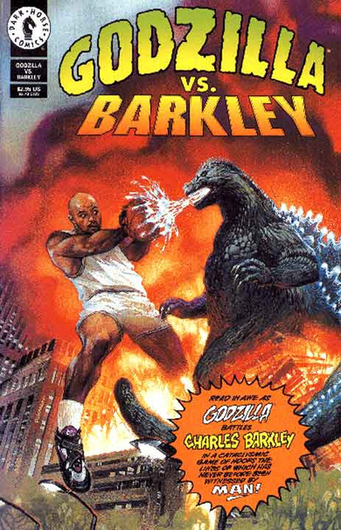
From the word go I pretty much knew I’d have to deal with this infamous moment in Godzilla history. For some reason in 1992, Nike produced a commercial in which Charles Barclay dueled with Godzilla in a game of basketball. The whos and whys of the duel weren’t important, not to the producers and certainly not to Godzilla. Either that ad proved successful enough to warrant a comic (not too rare given the Quick Bunny has teamed up with Superman) or a comic was released in conjunction with the ad; my research has not been forthcoming on the subject.
Regardless, that particular blend of ridiculous circumstances that borders on the insane eventually produced this amazing cover. I think my favorite part about this cover is Barclay is somehow blocking Godzilla’s atomic breath with a basketball. Video comic review Linkara took a look at the full issue over on the site Atop The Fourth Wall if you’re interested on the actual content of this cover.
Regardless, that particular blend of ridiculous circumstances that borders on the insane eventually produced this amazing cover. I think my favorite part about this cover is Barclay is somehow blocking Godzilla’s atomic breath with a basketball. Video comic review Linkara took a look at the full issue over on the site Atop The Fourth Wall if you’re interested on the actual content of this cover.

Now we return to Herb Trimpe’s much more excellently stylized cover this round with Monster Enslaved. I really love the look of Godzilla on this cover and the ridiculous logistics of how this scene could actually be playing out. The plot of the Godzilla comic was that Godzilla was actively being hunted down by the Marvel super spy agency S.H.I.E.L.D. That’s why you can see Dum Dum Dugan and Gabriel Jones there in the bottom left-hand corner.
It’s a little hard to tell but the thing Godzilla is being shoved into is actually a S.H.I.E.L.D. helicarrier, only it must be the biggest S.H.I.E.L.D. helicarrier in the world as we’re about to see. I also really like the doofy expression on Godzilla’s face. As much as like Herb Trimpe’s Godzilla work he never quite managed to encapsulate the pushed in face of the king of the monsters, making him look a lot more like a T-Rex; however, I absolutely love the image of Godzilla just passed out with his tongue hanging out as he’s dragged into a giant flying box for some reason.
It’s a little hard to tell but the thing Godzilla is being shoved into is actually a S.H.I.E.L.D. helicarrier, only it must be the biggest S.H.I.E.L.D. helicarrier in the world as we’re about to see. I also really like the doofy expression on Godzilla’s face. As much as like Herb Trimpe’s Godzilla work he never quite managed to encapsulate the pushed in face of the king of the monsters, making him look a lot more like a T-Rex; however, I absolutely love the image of Godzilla just passed out with his tongue hanging out as he’s dragged into a giant flying box for some reason.

Like I said, Godzilla is meant to be huge in the Herb Trimpe run. Here, he’s so big he has to bend down to eat the Space Needle in Seattle. Part of what I really like in this cover is we don’t often get to see Seattle destroyed. Even though the Space Needle is an incredibly recognizable landmark, Seattle often dodges the destruction bullet whenever giant monsters or natural disasters come along, so it’s nice to know it eventually got torn apart by Godzilla.
This was earlier in the series, the 2nd issue, before Trimpe really cemented his visual design of Godzilla hence his more monstrous design in this picture. He actually looks like Reptar from the Rugrats in this image only more bloodthirsty and devastating; the squat of the legs and back fins feel cut from the same cloth. I also especially like the spotlights in this cover. It’s a neat idea that Godzilla would somehow be lit at night as he attacks and well illustrated here.
This was earlier in the series, the 2nd issue, before Trimpe really cemented his visual design of Godzilla hence his more monstrous design in this picture. He actually looks like Reptar from the Rugrats in this image only more bloodthirsty and devastating; the squat of the legs and back fins feel cut from the same cloth. I also especially like the spotlights in this cover. It’s a neat idea that Godzilla would somehow be lit at night as he attacks and well illustrated here.
 5.
5.
Godzilla in the Marvel universe is what Godzilla King of the Monsters promised, and by God it delivered. I’m not even really sure what I can say to add to the sheer beauty of this cover; it’s the Avengers fighting Godzilla. It even manages to go one better than just being the Avengers against Godzilla because it’s the ‘70s Avengers with the emphasis being on Yellow Jacket and Wasp needing to stop Godzilla. I haven’t read this issue, so I can’t tell you how the littlest members of Earth’s greatest heroes managed to defeat the king of the monsters but I’m sure it was suitably ludicrous.
In case you only know these characters from the films, that’s Hank Pym in the Yellow Jacket costume as, for a time, he changed his superhero identity from Ant-Man to Yellow Jacket. I think my favorite part of this cover is Thor’s expression; even though by this point in his career he’d fought a whole cavalcade of Jack Kirby’s craziest monsters, he still looks completely dumbfounded by the sight of Godzilla. Incidentally, this is the most fiery Godzilla’s atomic breath has ever looked in the comics, or in the film aside from the Roland Emmerich remake.
In case you only know these characters from the films, that’s Hank Pym in the Yellow Jacket costume as, for a time, he changed his superhero identity from Ant-Man to Yellow Jacket. I think my favorite part of this cover is Thor’s expression; even though by this point in his career he’d fought a whole cavalcade of Jack Kirby’s craziest monsters, he still looks completely dumbfounded by the sight of Godzilla. Incidentally, this is the most fiery Godzilla’s atomic breath has ever looked in the comics, or in the film aside from the Roland Emmerich remake.

4.
This cover is so recent the issue it’s for hasn’t even come out yet. Godzilla in Hell is a new comic I reviewed over on Front Towards Gamer that’s about exactly what it says it’s about: Godzilla in Hell. Mostly the premise exists as more of a writing prompt than a hard and fast definition of plot, though the series is restrained to just charting Godzilla’s path through the underworld. It’s an amazing series with some of the best Godzilla artwork and action I’ve ever seen, and I absolutely love this cover.
The series so far steeps in Judeo-Christian mythology and symbolism blended up with the Godzilla series, and this cover perfectly encapsulates that. I especially like how all the avenging angels of this cover have butterfly wings. Godzilla in Hell has done a great job relating the various Toho monsters to different elements of biblical lore, like Ghidorah as the beast from the end of days. This is also probably the most faithful rendering of Godzilla we’ve showcased. His back spikes are more jagged and asymmetrical, and we can actually see the whites of his eyes; that goes a long way to making him seem like Godzilla.
The series so far steeps in Judeo-Christian mythology and symbolism blended up with the Godzilla series, and this cover perfectly encapsulates that. I especially like how all the avenging angels of this cover have butterfly wings. Godzilla in Hell has done a great job relating the various Toho monsters to different elements of biblical lore, like Ghidorah as the beast from the end of days. This is also probably the most faithful rendering of Godzilla we’ve showcased. His back spikes are more jagged and asymmetrical, and we can actually see the whites of his eyes; that goes a long way to making him seem like Godzilla.

In the modern-era, IDW has published a lot of Godzilla comics. Most of them are okay at best, though that’s about it; however, this cover for issue 1 of Godzilla Kingdom of Monsters perfectly gets Godzilla. I’m not even sure that eyeball we’re seeing actually IS Godzilla’s eye, yet it really doesn’t matter. Even if that’s King Kong’s eye it doesn’t matter, it perfectly captures the terrifying and destructive scale inherent to Godzilla’s underlying threat.
Ever since the ‘80s filmmakers pushed to revitalize the more serious-minded tone of original Godzilla films with mixed results, this cover gets back to that same feeling infinitely better than anything else Godzilla I’ve seen. It’s an instantly striking and memorable image that perfectly encapsulates what makes Godzilla threatening: his size. It actually reminds me of the marketing for the Emmerich Godzilla, the way all the billboards and banner ads were based around implying his size, though this cover does the same job infinitely better.
Ever since the ‘80s filmmakers pushed to revitalize the more serious-minded tone of original Godzilla films with mixed results, this cover gets back to that same feeling infinitely better than anything else Godzilla I’ve seen. It’s an instantly striking and memorable image that perfectly encapsulates what makes Godzilla threatening: his size. It actually reminds me of the marketing for the Emmerich Godzilla, the way all the billboards and banner ads were based around implying his size, though this cover does the same job infinitely better.

Before the Internet, geeks and nerds could only really communicate with a broader community through periodicals and magazines. Though the communities that formed out of these publications were smaller, they were no less dedicated and often people who would go on to be big names found their way into the horror, sci-fi, and fantasy subcultures through magazines. One of the biggest of these was Famous Monsters of Film Land, a series I’ll almost definitely be coming back to at some point in the future.
When I do come back to Famous Monsters of Film Land, I might put this cover on it twice because this is a beautiful cover image. Like the Godzilla Kingdom of Monsters cover, I love the size of the monsters in this cover, Godzilla in particular seems to be taller than 4 Empire State buildings. What’s more, there’s something incredibly eerie and unnerving about the coloring on these monsters, especially with that off-putting glow from the city destruction. Godzilla himself looks truly alien and demonic here, and Rodan looks positively terrifying. These Kaiju are beyond even forces of nature; they’re demons from Hell.
When I do come back to Famous Monsters of Film Land, I might put this cover on it twice because this is a beautiful cover image. Like the Godzilla Kingdom of Monsters cover, I love the size of the monsters in this cover, Godzilla in particular seems to be taller than 4 Empire State buildings. What’s more, there’s something incredibly eerie and unnerving about the coloring on these monsters, especially with that off-putting glow from the city destruction. Godzilla himself looks truly alien and demonic here, and Rodan looks positively terrifying. These Kaiju are beyond even forces of nature; they’re demons from Hell.

1.
If this last cover looks a little bigger than the others, it’s because it’s a wrap around. That means that the image extends from just the front cover all the way around to the back cover of the comic as well. Good thing too because this size of this image only contributes to its majesty. This cover basically IS Godzilla in every conceivable way. He’s emerging from the ocean depths; his face perfectly rendered in a snarl of primal fury that makes him look all at once majestic and deadly.
I really love the way this rendering manages to incorporate the classic Godzilla designs but reworking them in a more monstrous manner. If you look, Godzilla still has the standard iris/pupil eye design, but the sickly yellow of his eye makes him look infinitely creepier and more alien. Then there’s the just incredible texturing on his scales and back spikes. His spines look so jagged; it’s like they’re broken glass while his scales seem give off the aura of mythic armor more than reptile skin.
I also love the volcano behind him, literalizing the idea of Godzilla as a force of nature. What really makes this image pure Godzilla is the blend of emotions at hand. Godzilla is all at once threatening and awesome, an unstoppable force made all the more enticing by its supremely devastating power. I really love the way this rendering manages to incorporate the classic Godzilla designs but reworking them in a more monstrous manner. If you look, Godzilla still has the standard iris/pupil eye design, but the sickly yellow of his eye makes him look infinitely creepier and more alien. Then there’s the just incredible texturing on his scales and back spikes. His spines look so jagged; it’s like they’re broken glass while his scales seem give off the aura of mythic armor more than reptile skin.
No comments:
Post a Comment