

Edited by Robert Beach
So, Batman v. Superman: Dawn of Justice comes out today, or at least, I assume it did. I’m actually writing this the Tuesday before its release, so it’s completely possible some random calamity befell the intended release date. Somehow I kind of doubt it. By the time this goes up, I’ll most likely have already seen it. For now, I’m eagerly awaiting its release like the rest of us, so let’s talk about comic books instead, specifically some Batman and Superman comics.
So, Batman v. Superman: Dawn of Justice comes out today, or at least, I assume it did. I’m actually writing this the Tuesday before its release, so it’s completely possible some random calamity befell the intended release date. Somehow I kind of doubt it. By the time this goes up, I’ll most likely have already seen it. For now, I’m eagerly awaiting its release like the rest of us, so let’s talk about comic books instead, specifically some Batman and Superman comics.
Because Batman and Superman were DC’s
biggest success stories for decades and decades, the two eventually ended up in
a long-running comic together entitled World’s
Finest. World’s Finest was a weird amalgam of elements owing mainly to the
fact that it originally began in the late Golden Age and then continuing
through to the early Bronze Age of comics. As such, we’ve got some really crazy comic covers to get
through. Now it's time to dive into the shallow end and get the cover story on World’s Finest.


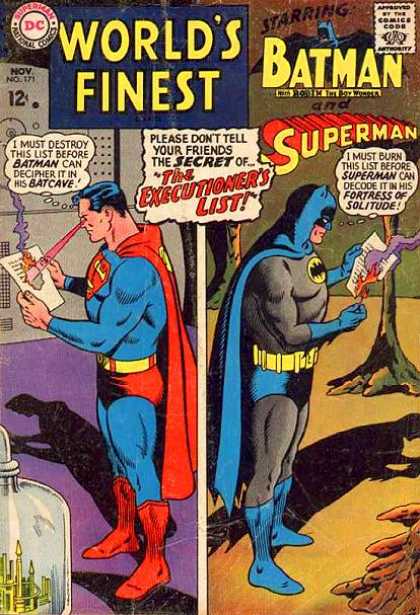
15.
We open in the Bronze Age with Superman and Batman literally
at each other’s throats. I haven’t
really spoken about Bronze Age covers previously, so this will be an
education. There are still heavy
elements of the Silver Age set-up here in that this is a crazy cover meant to
make the customer stop their shopping in a desperate need to read it. The biggest difference is in the
subject matter of the craziness. Here, it emphasizes the clash of characters and
unlikely situation.
The idea of Superman and Batman as being anything other than
super friends is actually quite modern. Having them literally try to kill
each other was code for “something is wrong here." That big mummy with a sun for a head is also pretty neat. The main reason this cover makes the
list though is that hilarious inter-title blurb claiming this is REALLY what
happens in the comic because spoilers: that is all lies. I’m pretty accustomed to covers lying
to my face. This is the first time I’ve seen one explicitly try and cover up
that embarrassing truth.

14.
Now this right here is straight Silver Age. In fact, the
trope of “characters getting shrunk” was one of the most universal and common
aspects of the Silver Age. Seriously, there’s nothing about this cover I don’t absolutely
love. Firstly, there’s the giant
Robin looming in the foreground who, despite his size, is still presented
without any form of greater detail or identity. I’m not exactly sure what the foreshortening is meant to be
on these depictions of Batman and Superman as they look pretty large for guys who
have been shrunken. Maybe “action figure sized” was the intended height
their shrinking machine was set for.
My favorite part of this cover though has to be the
juxtaposition of inter-title and characters. The inter-title reads “the dictator of Krypton City!” With Robin’s giant state, I can only assume he’s turned evil and plans to go
run Krypton city…whatever that is.
Given the number of covers that are just Superman and Batman treating
Robin like hot garbage, it honestly wouldn’t be that surprising.

13.
I don’t even know where to begin with this cover. One of the weird trends of the Silver
Age was a tendency to extend heroic endeavors into the character’s early
ages. That’s why, for the longest
time, Superboy’s adventures were those of tween Clark Kent. And there was a long-running series of adventures of Wonder Woman as a toddler called Wonder Tot
(yes, really). This particular
cover is a dip into that well along with the occasional and bizarre instance on linking Superman and Batman together at the familial hip. Seriously, there’s one old story where
Ma and Pa Kent use Kryptonian technology to try and prevent the Wayne murders.
Putting weird history aside, this is actually a pretty great
cover just in terms of a unique and striking idea to be executed. You basically know that Batman isn’t a
depowered Kryptonian, but him presenting the visual evidence has a weird,
authenticity to it that’s eerily compelling. I think part of it has to do with the projector, the
stills, and the looming questions of who took those pictures and how did they get
off Krypton? I also just
absolutely love Batman’s fake Kryptonian name, “Bruce-El,” which clearly took
no effort on anyone’s part.
Also, Superman’s literal gape-mouthed surprise is absolutely beautiful. He’s completely taken in, yet what looks like the most blatant ruse Batman has ever pulled. Other fun fact: this was almost the plot to J.J. Abrams' proposed Superman movie only that would’ve had Lex Luthor as a secret Kryptonian because Abrams is a hack writer.
Also, Superman’s literal gape-mouthed surprise is absolutely beautiful. He’s completely taken in, yet what looks like the most blatant ruse Batman has ever pulled. Other fun fact: this was almost the plot to J.J. Abrams' proposed Superman movie only that would’ve had Lex Luthor as a secret Kryptonian because Abrams is a hack writer.

12.
This is actually one of the better-remembered Silver Age World’s Finest covers. See, even though most fans tend to
disregard the Silver Age as campy nonsense not worth preserving, there are a
handful of stories and cover images that’ve been accepted into nerd canon as
something worth preserving and referencing. Mostly these are rooted in Batman stories and come with a
dollop of self-inflicted irony. But they do make-up the essential canon of covers
that matter from that era as far as modern artists are concerned.
There are a lot of reasons for this cover to be placed among
that group. The primary one being it’s just a wonderfully conceived image that
features greater depth than most Silver Age covers. I don’t mean that figuratively incidentally. This image is
literally composed to imply three levels of depth with the city background,
Batman and Superman in the foreground, and Luthor and Joker in the front
row. At the same time, this cover
features possibly 4 of the most recognizable and well known comic characters of
all time. It was always destined to end up in the front of people’s memories, and the situation is pretty delightful owing to how out of character it is for
everyone involved.

11.
Ah the Super-Sons, one of the greatest ideas to never quite
crossover into the mainstream. Remember how a few entries ago I discussed how superhero stories in the Silver
Age tended to extend into a character’s adolescence? Well, as the Silver Age gave way to the Bronze Age, that idea
shifted from young versions of adult heroes to young heroes with the same
theme, mainly thanks to the success of the original Teen Titans comics. In the case of the Super-Sons, they were
a way to keep telling teen Superman and Batman stories without needing to de-age
the characters.
The pitch was the Super-Sons were the respective sons
of Batman and Superman in the future who grew up together owing to the
closeness of these super families. That’s something that’s always informed a lot of Silver and Bronze age
DC superhero stories: family. History aside, this cover is just phenomenal. It's a great example of how
weird and wild comics got to preserve their angle while also showcasing the
‘70s emphasis on “teen rebellion” from its younger heroes. I really love that Superman and Batman,
even as dads, have giant posters of themselves just plastered all around town
like some kind of fascist dictatorship. Also, major points to Bat-Son for having the stripiest pants ever tailored
by human hands.

10.
Another classic cover, this one a bit more memory-holed
owing to the fandom rejection of Bat-Mite. Like a lot of well remembered Silver Age covers, a lot of
this one’s artist appeal emerges from the construction of the image to showcase
4 central characters with a split between heroes and villains. Incidentally, for folks who’ve only
ever known Mxyzptlk from the animated series, this is what he normally looks
like. In a lot of ways, this
team-up was inevitable, but also pretty groundbreaking in a unique way.
See, both Mr. Mxyzptlk and Bat-Mite are impish pests with
God-like powers that developed independent of one another to annoy their
respective heroes. Having them
crossover here also established the idea that they were both members of the
same species: 5th dimensional hyper-imps, an idea that's persisted
to the modern age of comics. This
kind of continuity represents some of the first steps DC would take to
establish a shared universe of characters prior to Marvel’s entrance into the
comic book world.

9.
Another Super-Sons cover that shows they really are their
fathers’ children. Incidentally, for those wondering, the super-moms are almost never on hand which has led me to
suspect this was some clever writer at DC’s way of getting his Batman/Superman
slash-fic published under the radar, crafty devil. In all honesty, this cover is incredibly quintessential to
the Silver Age by a whole slew of metrics. I’ve already devoted a full 25 covers to Superman playing
cruel practical jokes on his friends and loved ones. By now, it should be
clear “heroes acting like jerks” was the bread and butter of this era in
comics.
Extending that activity to their children is a perfect
conception, especially given the number of Super Baby stories published at the
time (again, this really happened). I do like how much the Super-Sons have inherited their dads’ skewed
sense of what a prank is. I mean, Bat-Son is dumping a bunch of poisonous
reptiles on his dad, and Superman Jr. is trying to blow his father to kingdom
come. Rotten apples stay in the
rotten orchard I guess. Also, points for the Batman mask deliberately borrowing
the Adam West mask affectation.
8.
God, this is a beautiful cover. It’s on the lower end of the whole “important classic
covers” roster, though it’s still a beautiful rendering and one of the best uses of
a comic cover I’ve ever seen.
The whole reason we remember certain classic covers is that
they pioneered the use of covers as a visual medium to convey information as
well as construct artistic visuals, and this is a perfect example of that
fusion.
Right away, it invests you with everything you need to know about the seriousness of this situation. And the fact that it places Superman and Batman at some kind of rift while also highlighting the pre-existing differences between their worlds. I’m a sucker for that kind of visual contrast. Plus, we even get a cameo appearance from the Bottled City of Kandor, so that’s nice.
Right away, it invests you with everything you need to know about the seriousness of this situation. And the fact that it places Superman and Batman at some kind of rift while also highlighting the pre-existing differences between their worlds. I’m a sucker for that kind of visual contrast. Plus, we even get a cameo appearance from the Bottled City of Kandor, so that’s nice.

7.
Another brilliant and well-remembered cover, this one
features one of the greatest mysteries of all time: what in the hell science
is Batman up to right now? Admittedly, “scientist” is one of the more infrequent hats that Batman
wears alongside stunt driver and astronaut. He still has done some science
in the past, but nothing that would necessitate Robin taking diligent clipboard
notes. I guess it’s possible Robin
was just doing his own science with that microscope hidden behind his hands. That just raises its own slew of question like is this the boys’ science hour
or something?
Additionally, I absolutely adore the fact that Superman
couldn’t just report the bat-cave’s location himself. He had to lead a gaggle
of reporters through god know’s how much rock and dirt to tunnel into Batman’s
secret hideout. This was
originally intended to end up on the “Super Jerk” list, but it got edged out
by the other covers with even pettier jack assery from the Man of Steel. Glad that “The Day Superman Betrayed
Batman” finally managed to get a spotlight here, it’s certainly earned it.

6.
Another Bronze Age type cover as evidenced by Batgirl’s
presence. She didn’t enter the comic book universe till after her inception in
the Adam West Batman show. Like with a lot of other Bronze Age
covers I’ve showcased, what makes this cover quintessential of the era is the
scope and emphasis of the situation being depicted. As in the Silver Age, the image is deliberately goofy and
insane, showcasing a pretty hilarious spin on the older heroes (who were coming
up on 30 years at the time) clashing with their young replacements.
The difference is in how static the composition is, willing
to showcase a single well-detailed image rather than the vast, frenetic, and
often psychedelic content of most Silver Age covers. What’s more, the weird comedy of the cover comes from the
contrast of the characters and their situation rather than just random aliens
or crazy murder. I do like how
even Supergirl and Batgirl have succumb to the cruel pranking that seems to
inform ALL DC superheroes prior to the mid-70s. If your plan is to convince the world’s foremost
heroes they’re washed up has-beens just for a larf, that is incredibly
cruel.

5.
Another great example of Bronze Age thinking in superhero
adventures. The situation is
classic comic book weirdness and has actually happened on numerous occasions. Having the hero throw down with their own alter-ego was so common
for a time it was only matched by the hero’s costume gaining sentience and
rebelling against them (yes, really).
This cover is a little cluttered compared to most visualizations of the idea. As far as visual balance goes, it’s not the best of the era, but it’s still pretty great. My favorite part of the cover has to be Robin’s dialogue balloon saying he’s going to beat up the “real” Dick Grayson. I’m honestly not sure if that identifies him as a horrifying copy outing himself to the reader by accident or if he’s just trying to throw us off the scent and really failing at it.
This cover is a little cluttered compared to most visualizations of the idea. As far as visual balance goes, it’s not the best of the era, but it’s still pretty great. My favorite part of the cover has to be Robin’s dialogue balloon saying he’s going to beat up the “real” Dick Grayson. I’m honestly not sure if that identifies him as a horrifying copy outing himself to the reader by accident or if he’s just trying to throw us off the scent and really failing at it.

4.
This is art. I’ve never once seen a more beautiful rendering of not caring
than this image. Everything about
it is perfection. It’s like a
brilliant deconstruction of the classical formation of a joke with Batman and
the firemen as the standard set-up, straight-faced and stoic, completely
involved in their very serious task of rescuing someone when suddenly
BOOM! Then Superman looks so
serious in his destruction of their equipment/floor as if he planned his
entire day around this one single act of perverse japery.
I especially like the speed lines around him, just in case
you thought the catching apparatus was somehow faulty. Oh no, this is all Superman’s fault. He
saw someone else trying to learn how to be useful and save lives, and he was
having none of that. Actually,
given the exploding ground and the continuing speed lines, I can only assume he
kept rushing downward into the Earth’s core only to pop out the other side and
never explain his actions. That
would certainly fit with the other act of Super dickery we’ve seen.

3.
Can I just say that “Dig Now, Die Later” may be the greatest
inter-title I’ve ever read. This
image is actually kind of brilliantly predictive of what eventually ended up
happening to Jimmy Olsen and Robin in their respective franchises. I mean, Robin has all but disappeared
from all Batman adaptations. When he does show up, it’s the weird “hip”
version of the character from Arkham
Knight. Conversely, Jimmy
Olsen hasn’t mattered to Superman in forever, and we’d probably have forgotten
he existed if not for his appearance on Supergirl.
That aside, my favorite thing about this cover, apart from it
featuring Batman and Superman initiating a mob hit on their teen sidekicks, is
that the dialogue implies Batman has no code against killing. Superman specifically says
he has a code against murder, and Batman’s just like “lol, not me, why do you
think I have this tommy gun?” Incidentally, I do like that Batman came totally prepared to machine gun
Jimmy and Robin to death in the shallow graves they dug for themselves. Other evidence of Batman’s preplanning:
the foresight to have them dig their own graves in this cemetery, the last
place people would be surprised to find dead bodies buried in the Earth. Batman really does plan for everything
I guess.

2.
I know a lot of folks love the Superman/Batman fight from Dark Knight Returns, but those people are
all fools who know nothing of excellence: this cover is where it’s at. I think this might be the
best rendering of these two going at it outside of Batman: Brave and the Bold’s Battle of the Superheroes
episode.
Additionally, the cover's a nice inverse of the number 3
spot. In case it’s not obvious, this is taking place in the bottle city of Kandor, which exists under a
miniature red sun of its own. That’s why the guy in the red and yellow on the left, who is Jimmy Olsen
dressed as Kandorian hero Flamebird, is saying Superman doesn’t have any powers
here. But yeah, it’s Jimmy Olsen
and Robin egging their respective owners on to kill each other in a literal gladiator
match inside a tiny city rescued from Superman’s home; that is awesome.

1.
I know, it’s weird that the final cover in this celebration
of Batman and Superman are them playing baseball against the reader (I
think). It’s weird that this the
number 1 spot goes to a Golden Age cover with the most basic visual conception
and even fewer details than most other covers. I realize all that, and this is a very strange cover to
showcase as the best vision of a Batman/Superman team-up, but hear me out on
this one. I’ve always been of the
opinion that Superman and Batman should be friends; that they should want to
spend time together and actually like each other on a level beyond simply being
coworkers.
Even through the countless cruel practical jokes, fan versus
matches, and occasional attempts to conquer the globe, they just make sense as
friends. This cover
might be goofy and antiquated as all hell. It’s still the best embodiment of
that fundamental idea, of Superman and Batman as friends who choose to spend
time together outside of stopping crimes and JLA meetings. If superheroes are to have a life
outside themselves and exist as three-dimensional characters, our look into
their lives can’t be confined to just them fighting. It has to include them
being human as well.
if you liked this article please like us on Facebook or follow us on Twitter
if you liked this article please like us on Facebook or follow us on Twitter
No comments:
Post a Comment