

If you liked this article, please like us on Facebook or follow us on Twitter and please consider Donating to keep the blog going
Lex Luthor. It’s a name that wrings loudly through the halls of supervillain infamy alongside such titans as Dr. Doom, the Joker, Loki, and Thanos. Created in 1940, Lex Luthor is one of the oldest and most well known super villains of all time. He’s appeared in almost every Superman-centric piece of media we’ve had, played by countless actors and enjoyed numerous solo comic appearances as a protagonist in his own right.
His obsessive dedication to destroying the man of steel has shaped up to be one of pop culture’s greatest David vs. Goliath stories running across decades and multiple iterations of the character: he’s been a rogue scientist, a business guru, President, and a superhero in his own right. This Sunday will mark Luthor’s first live-action appearance on the CW show Supergirl, played by Jon Cryer, and while that’s not quite as momentous as it might’ve been given we live in the Superhero Age I’ve still decided to mark the occasion with a deep dive into the top 12 Lex Luthor comic covers.


12.
So we’re starting with kind of a strange entry, this is something called an ‘Imaginary Story.’ Imaginary Stories were a strange conceit of DC in the Silver Age as a way to do one-off bizarre explorations of ideas that the authors didn’t want to keep in-continuity. It didn’t survive into the ‘70s but a lot of Imaginary Stories of the ‘60s were integrated into continuity in one form or another, most notable among them being the comic where Superman split into two different versions of himself called Superman-Red and Superman-Blue. This particular Imaginary Story is actually exactly what it says in the caption box: the Death of Superman and, this being a non-canon story, they don’t chicken out. Just as the cover depicts, Lex Luthor totally kills Superman in this issue through Green Kryptonite poisoning.
That’s a pretty robust background but even without that element, this is a really unique and dynamic cover for something from the Silver Age. A lot of that comes down to scale, the actual content at hand is pure Silver Age: a shocking image that demands to be read to be understood, even if it didn’t turn out to be a trick in this case. However, having Superman’s lifeless corpse take up so much of the cover was a unique approach for the time and the way the other characters are only partially visible speaks to a more mature perspective.
It’s a cover that isn’t relying on action or scale to sell its contents rather an understanding that you, the viewer, grasp the importance of this image even if it’s not covered in movement lines. What’s more, the color work is really excellent as well, creating a great visual binary between the primary colors of Superman’s costume and the green/purple combo that tends to inform most of his bad guys.
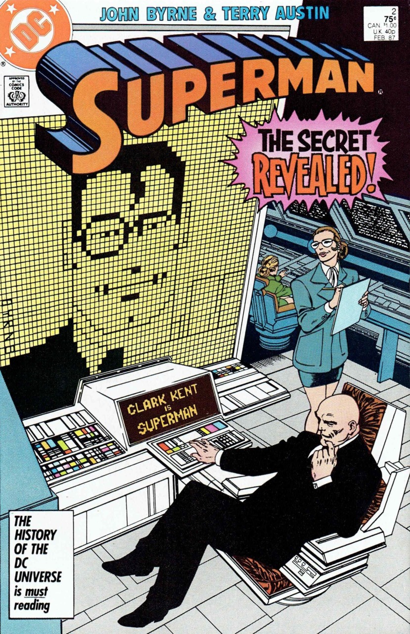
11.
Something I absolutely love about this cover is the dopey, MS Paint style visual the computer has cooked up to match its “Clark Kent is Superman” conclusion. This issue comes to us from the post-1986 revamped Superman comic that was overseen primarily by comics legend John Byrne. This issue has gone down as an all-time classic of that run, and with good reason. The story is of Luthor punching a bunch of information into a supercomputer to calculate who Superman is, it gives him the right answer, only for his own ego and cynicism to render him unable to believe that Superman would ever masquerade as a human. It’s a great idea and a great cover to match, one that actually does happen in the comic much like #12.
This is a good example of how the flatter approach to colors in more modern comics can still yields impressive results as everything in this scene is muted but still very clear thanks to the bold line work. I especially like the way the scene is divided between the computer screen, Luthor, and his hench-woman, it creates a natural three-point visual to guide the eye. At the same time the softer colors make that “SECRET REVEALED!” caption burst pop all the better. It’s also pretty funny seeing Luthor make all these complex calculations on the equivalent of an Apple 2E monochrome computer.

10.
Lex Luthor: Man of Steel is not a great comic but this cover is pretty superb. Unlike the two preceding ones, there’s less merit to the content of the actual issue and more to do with the iconography being used here. This particular pose of the protagonist snapping chains across his chest has become one of the most iconic Superman poses there is ever since appearing in Superman 233 in 1971. It’s a clear projection of strength and overcoming limitation and the idea of applying it to Lex Luthor is spot on for his character. A big part of what’s always made Lex more than just a mad scientist or an evil CEO is that he’s meant to embody humanity’s greatest potential used for its greatest evil, an equal to Superman in all but goodness.
This is a great reversal of the original imagery, both figuratively and literally as the image is flipped with Luthor facing the opposite direction from the original cover. I’m not as huge a fan of the pure red color work, I don’t really know why they came to that conclusion, but it also doesn’t really hurt the image. It’s certainly a more impressive look than if they had just had him in his white shirt and gray pants doing the same and this was also in those strange days before Luthor had his lexo-suit brought back into continuity.

9.
‘One Year Later’ and ‘Up, Up, and Away’ were a pair of stories in the mid-2000s basically meant to right the DC universe after a period of getting somewhat off the rails. ‘One Year Later’ was a branding event across multiple books to have them flash-forward in time by one year as a way to set-up new creative teams and new status quos, while ‘Up, Up, and Away’ was specifically meant to get Superman and his comics back to a more streamlined and clear continuity after about 5 years of increasingly mangled and confusing storylines. A big part of that was returning Luthor to his rogue scientist roots after spending nearly 20 years as an evil CEO, hence this particular transitional cover.
I really like how it symbolically feels like a bridge between old Luthor and new Luthor, with him sporting the power suit of the classic design but steeped in the weird science crystals that would become his trademark. Those are Kryptonian crystals as well, incidentally, as another big part of ‘Up, Up, and Away’ was streamlining what Krypton was and how it was visualized. I actually think the idea fits Luthor really well as he’s always had a taste for ironic attacks on Superman, after all, he could use any number of weapons against the man of steel but he always defaults to Kryptonite, small reminders of Superman’s home that only cause him deadly pain.

8.
As the banner title suggests this cover came in the wake of the very popular and overall pretty good Blackest Night event. During said event, Lex Luthor became a deputy Orange Lantern of Avarice, complete with this awesomely designed energy version of his war suit. This was also the first cover from a full on take over of Action Comics by Lex that turned into one of DC’s better comic solo explorations of his character. I’m not sure I totally dig the idea of Lex being an avatar of greed but I can’t deny the image of him with the power ring and energy armor is badass. They manage to wring a superb amount of detail out of this image given it’s all rendered in orange, which is a very tricky color to work with given how easily it bleeds into red or yellow.
I actually think this Orange Lantern version of the Lexo-Suit is a major step up from the normal model as I’ve never cared for the upside Superman-crest of the classic suit and the big Orange Lantern symbol on the chest is a much better and more definable visual to build the costume around. Also just as a minor note having him perched on a pile of skulls is a really nice touch and even fits with the Orange Lantern concept as the way the ring works is that anyone an Orange Lantern kills becomes recreated within the ring as energy servants.

7.
Luthor with powers is an absolutely great motif that pops up in a number of his covers but I think this visual of him flying over the Earth might be the best of the bunch. It’s a very evocative image and, similarly to #9, speaks to the transitional phase Luthor was in at the time. This comic, 52, was set during the so-called “Missing Year” that set-up that ‘One Year Later’ branding initiative I showcased earlier so it was literally the story of how Luthor moved away from his company and business schemes and settled back into secret laboratories and power schemes, with a whole major plotline revolving around a project to give himself superpowers.
That’s beautifully rendered here with him striking the Superman pose above the Earth, high concept and bizarre but still clothed in the well-tailored business suit that was always meant to make him seem like a more realistic villain. Also similarly to cover #10 this is an image that has Luthor assuming Superman’s pose and style, emphasizing the way he covets Superman’s power but not his responsibility or morality.

6.
This is such an old school, Silver Age style cover it’s downright ridiculous. This kind of return to classicism and emphasis on bigger, bolder weirdness was a hallmark of Grant Morrison’s 1996 JLA comic and the entire ‘Rock of Ages’ story speaks to his very weird aesthetic. Firstly the color use here is a major cut above the material of the time with a lot of bright spots like Martian Manhunter’s green, Superman’s electric blue, and Joker’s lavender suit. Even Batman looks brighter than usual with his yellow oval costume and the blue tint of his boots and cape. It’s a showier cover than most of the others I’ve brought up, as furthered by that word balloon. Seriously, by the ‘90s no one was using word balloons like this on comic covers anymore except ironically, which this is admittedly doing to a degree.
The purposely-stilted dialogue form Batman is obviously meant partly as a joke though this does more or less happen in the issue. I also absolutely adore that expression Luthor is giving like he’s pleased with how angry he is. Also, there’s just really superb flow here, starting with the word balloon drawing the eye downwards as you read it, leading into the heroes whose stance parallels the slope of the floor leading us over to the villains as they skulk away. It’s a tribute cover to Silver Age comics but with modern conventions.

5.
One of the core tragedies of Lex Luthor is his steadfast belief that he’d truly be a great hero if not for Superman. Depending on the incarnation that can be a legitimate failing of his own imagination or an elaborate form of self-delusion but Lex’s quasi-heroic streak feels like a firmly entrenched aspect of the character that it’s wrong to simply discard. As such, I absolutely freaking love this cover, featuring him leading a ragtag band of freedom fighters through the shattered hellscape of a dark future without Superman.
This comes from the acclaimed ‘Camelot Falls’ storyline, which was based around Lex’s constant claim that Superman coddles the human race too much, that civilization has to fall naturally so that it can rise again and that by denying that cycle Superman is making mankind’s inevitable fall all the worse. This visualization of the dark tomorrow left in Superman’s wake does a great job conveying how broken this world has become (with a really nice visual of the daily planet building smashed in the background) but also featuring 4 characters who carry on Superman’s legacy in some way, even Lex. It’s a great dive into the idea that in the absence of Superman or faced with a deadly enough threat Lex Luthor can still find it within himself to do the right thing, even if it’s just to preserve the legend of Lex Luthor.

4.
This is an interesting cover because it comes to us from the Bronze Age of the ‘70s but is still reflective of the Silver Age style shenanigans that were Superman’s bread and butter for so many years. It’s still a shocking moment from the issue, complete with speech balloons and thought bubbles, and is probably misleading about what actually happens (especially given Luthor’s shoes are drawn with a mysterious energy glow to imply he’s cheating) conceptually this is a ‘60s cover. In terms of construction and technique, though, this is totally a product of the Bronze Age. The bulk of the action on the page is Superman and Luthor, shirtless and brawling, rather than the weird alien location something else colorful and bizarre.
The two leads are afforded more central space on the cover because the creators are more confident that the reader will understand the importance of the image in the context of the magazine rather than as a shocking bit of creative weirdness. Even the background is devoid of what you might expect from a space-set Superman comic as the red sun planet is fairly barren and unimpressive with a basic sphere space ship the only means of transit. No, the core of the image is Luthor v. Superman, no powers, just fisticuffs and true grit, even if I suspect Lex isn’t playing fair.

3.
This may be the purest distillation of Lex Luthor’s savagery and tragedy as a character in comic cover format. It’s such a perfect look at the massive egotism and self-delusion that his obsession with Superman affords him, the complete refusal to take any responsibility for his actions or acknowledge his own many failings, it’s Lex Luthor, Shakespearian tragedy, writ large. What’s more, the artwork of this cover is just superb. It’s another Bronze Age take on a Silver Age idea, with the high level of detail to the destroyed city reflecting conventions of the time. I absolutely love that among the rubble of Metropolis a random “no standing” sign somehow managed to survive whatever doom Luthor brought to Earth.
There’s also a really nice use of building destruction here to frame Luthor’s pose, with the shattered buildings on either side of him while he shoves a defiant fist into the sky. It helps him and his speech balloon pop more against the icy blue of the sky rather than the highly detailed devastation. I also really love the cracked and broken Superman statue taking up the full right of the frame. It’s a fitting tribute to Luthor’s unhinged madness as it reflects the perfect strawman Superman has come to be for Lex, a foe that excuses his every action, no matter what atrocity he commits it’s okay because Superman made him do it.

2.
There was no way we were getting through a Luthor cover list without touching on his time as President but I actually think this superbly creative cover is the best artistic work to come out of that ill-conceived era. Normally I’m not a fan of these kind of extreme close-up covers but there’s a cheeky irreverence to this one that I think actually fits the weird tone set by the actual events of Lex 2000 (as it was known at the time.) The basic image of Superman’s cape is hardly an iconic one but it has its own weight to it, mainly thanks to the old “you don’t tug on Superman’s cape” saying, which I definitely think this cover is meant to evoke.
The “Vote Lex” button stuck onto it in the style of a “KICK ME” sign feels a lot like a prank or joke, which was ultimately the crux of Luthor’s entire scheme to be President. He didn’t really use his powers at the time to hurt Superman or do much more than cameo in a bunch of other comics, it was basically a whole Presidential campaign meant to get in Superman’s face and tick him off. Sometimes the best villainy isn’t about the impact it’s about the scale of how petty you’re willing to be.

1.
From the second I saw this cover I knew it had to be number 1. Not necessarily because it shows the cleverest use of the medium technically, that’s actually probably #2, no but because of how well it encapsulates Lex Luthor. See, the deep unspoken truth of Lex Luthor is that despite all his grandiosity, despite his company and his war suit he is a very, very, very small man. That’s the deep dark truth at the core of his character, that despite how much he loves himself and views Lex Luthor as humanity’s greatest achievement all he’s ever done is squander his potential.
Even before Superman arrived on the scene in Metropolis, Lex Luthor was never anyone’s idea of humanity’s future, even an evil one. He busied himself with black market arms deals and slum lording, Lex Luthor was never going to be anything more than a sad little man clinging to the things that made him feel big and this image captures that fact perfectly. The encroaching darkness of his own obscurity illuminated only by his connection to Superman in the kryptonite, a man in chains of his own making forever on the verge of being completely subsumed by the darkness of anonymity. He’s not a man of steel or a man of tomorrow, just a small coward clinging to what makes him feel big.
If you liked this article, please like us on
Facebook or follow us on Twitter and please consider Donating to keep the blog going
Oliver (Finding Nemo)
ReplyDeleteOliver is one of the supporting characters of the Finding Nemo franchise, serving as a major character of the Disney/Pixar's animated film, Finding Marlin, and one of the two tritagonists (alongside Derek) of its fourth sequel, Finding Hank.
DeleteIn Finding Marlin, he was voiced by Alexander Gould who previously voiced Nemo in the first movie, and voiced Bambi in Bambi II. In Finding Hank, he is voiced by Ben Schwartz who also voiced Skidmark in Turbo, Randy Cunningham in 9th Grade Ninja, Sonic the Hedgehog in the 2020 film adaption and its 2022 sequel, Dewey Duck in the 2017 reboot of DuckTales, Leonardo in the Rise of the Teenage Mutant Ninja Turtles series and its feature film sequel, and Mark in DC League of Super-Pets.
DeleteIf you've lost your funds to any dubious online investment scheme, it is now possible to recover your funds. All you need to do is reach out for the service of a tech personnel to get the job done. I was able to recover my 0.739BTC that I lost to an investment scam. Thanks to the service of this tech guru at 'hackingloop6@gmail. com, the genius is regarded as one of the best recovery experts in the market. The best part is as a Guaranty that he gets the Job done. You can also chat with him on WhatsApp + 1 (484) 540 - 0785, if you're not able to withdraw your BTC, USDT, ETH, or USDC from any online trading platform and other hacking-related services. His services are very affordable and reliable..
ReplyDelete