

Edited by Robert Beach
In approximately one week’s time, Captain America: Civil War will hit theaters (in the United States). It’s a big deal. The completion of Marvel’s 2nd film trilogy and first phase 3 entry, two facts that are bolstered by the way Captain America has emerged as the ambassador of the superhero genre to the masses in the 2010s.
In approximately one week’s time, Captain America: Civil War will hit theaters (in the United States). It’s a big deal. The completion of Marvel’s 2nd film trilogy and first phase 3 entry, two facts that are bolstered by the way Captain America has emerged as the ambassador of the superhero genre to the masses in the 2010s.
For better or for worse, Captain America is THE superhero of
the decade, and this latest film looks to be his greatest journey yet, pitting
him against a world desperate to bring his closest friend to task for crimes he
may not have committed. I’ll be
doing a lot of posts related to the upcoming premiere. For now, we celebrate
the “best friend” of that synopsis with the top 10 Winter Soldier comic covers.


10.
Something to understand about Winter Soldier is that even
though he’s Cap’s best friend, he’s always been way more of a ruthless spy than
Captain America ever was. In fact,
during the comics run that created the Winter Soldier, it was established that
Bucky became Cap’s sidekick as a way to give him a wetworks operative to take
on the nasty, amoral stuff that Captain America couldn’t or wouldn’t
handle. As such, a lot of these
covers are going to be espionage-esque, and this is a great example of that. Firstly, anything that teams up Winter
Soldier and Black Widow is a great concept: a pair of Soviet super spies that
go great together. More than that, this is just a great espionage synthesis
cover.
The visual design is a unique blend of the busy scope of a
James Bond poster with sleek, modernistic elements of a Tom Clancy novel
cover. I also really love the
color cohesion of this cover.
Winter Soldier’s visual design emphasizes black and silver with a splash
of red on his arm, so the major emphasis on deep reds and whites in the color
helps him and Black Widow stand out well against the backdrop. It’s also pretty great that they got
the soviet hammer and sickle in the logo as, in the comics, Winter Soldier
worked for the USSR rather than Hydra.

9.
Man, this is a freaky visual cover. The effect at hand is meant to mimic one of those Russian
nesting dolls, or possibly the woman suit from Total Recall. You’ve
got these expanding layers peeling open to reveal the man within, each previous
layer tying to one of Barne’s previous identities. The outer shell is his identity Bucky, Captain America’s kid
sidekick in World War 2, while the secondary layer is the costume design he
used when he took over the mantel of Captain America. Finally, underneath all the superficial layers of false
heroism and innocence you’ve got the Winter Soldier, all black leather, red
eyes, and evil smirks. It’s a
chilling visual that postulates a very cynical view on the true nature of the
character.
The cover comes from the second Winter Soldier comic in
which Bucky went into space. It’s
a weird series, focusing on Winter Soldier hunting down possible threats to
humanity for preemptive termination. The entire idea stems from the concept that Bucky is the only “hero”
skilled and unhinged enough to travel the universe and murder aliens for what
he assumes is the greater good. That concept is pretty well depicted here with Bucky’s idea of
embracing his true “heroism” going hand-in-hand with a complete rejection of
his previous identities as an idealist rather an amoral pragmatist.

8.
Admittedly, this is more of a Black Widow cover than a Winter
Soldier one. It’s still a great cover, so it makes the list. Like the number 9 spot, what I like
about the cover is its excellent fusion of espionage aesthetics. This cover is less informed by the
scope and scale of Bond covers and more reminiscent of ‘70s slow boil espionage
visuals. The key visual dynamic of
layering is what grounds in that aesthetic. The way Black Widow forms the
background as Bucky and the helicarrier form the foreground. Again, the technological emphasis and
hardcore visuals are drawn more form the palette of modern spy fare like Splinter Cell or Jason Bourne. It
works well with Winter Soldier’s greater emphasis on harsh espionage
plots.
Something I really like about the visual lay out of the
cover is the way Black Widow’s hair forms into a red background on the right-hand side of the cover. It makes
for a nice contrast with the block white color on the left hand side of
things. I do wish the red tint on
the additional visuals was a little more pronounced, especially the
helicarrier, which risks blending into Black Widow’s hair; however, it’s still a unique approach to design and captures the mood and aesthetic of harsh
espionage the cover seems to be aiming for.

7.
Now here’s something a lot more metaphorical and less spy
oriented. I still really like it. As I mentioned, the Winter Soldier of the comics served as a secret
operative for the Soviet Union rather than Hydra and, as a result, elements of
Soviet iconography like the hammer, sickle, and red star have come to really
define his visual palette. This
cover is a great example of how to use those elements to striking impact. The visual of the red star bleeding
down Bucky’s arm is just beautiful and thoroughly impressive, a great metaphor
for the idea of his time as a Soviet slave leaving him with blood on his
hands. That alone might not have
got the cover on this list, considering the block color background. It's the right-hand side of the background that really sells this
design.
In case it isn’t clear, what we’re seeing here are Bucky’s
various victims from the decades and decades he spent in the thrall of the
Soviets. It’s a chilling concept
made all the creepier by the red star print as a way to indicate a successful
kill. The Winter Soldier comics
have managed to wring a lot of angst out of Bucky’s traumatic past, and this is
a prime example of that. And at
the same time, I’m an absolute sucker for Cold War spy iconography.

6.
Another cover from Bucky’s time as Earth’s extraterrestrial
defender with a cameo from everyone’s favorite Asgardian Loki. This cover might’ve been a bit more
impactful had the planet on Bucky’s back been the Earth, but it’s still a very cool
metaphorical image. Actually, I
say it’s metaphorical. I haven’t read this issue, so it’s entirely possible
that this is literally what happens in the comic, (which would make this the
best god damn comic of all time). It certainly wouldn’t be any more ridiculous than throwing Bucky and
Loki together, the two most beloved villains of the MCU. I’m not exactly sure why the Loki on
hand here is the classic version of the character as opposed to the anti-hero
concept from Loki, Agent of Asgard,
but it doesn’t really matter.
The framing of Loki in his classic mischievous
supervillain garb really fits the tone of this cover. You don’t get the sense he dropped the moon on the Winter
Soldier to be malicious or because he plans to nuke the Earth, but really just
because he wants to screw around and ruin Winter Soldier’s day. That’s the mischief you tend to
associate with old Loki, throwing planets at genocidal super soldiers because
“eh, something to do.”

5.
So I’ll be honest here. All the reasons I’ve cited so far
about visual metaphor, history of espionage visuals, and increased meaning of
soviet iconography is going right out the window for this one. This cover is
just awesome because gorillas with machine guns are awesome. Seriously, I don’t even know how I’m
supposed to argue this point. It’s a gorilla with a mini-gun. If you don’t get
that just by looking at it, I genuinely don’t know what I can add that will
convince you of its pure and unadulterated awesomeness.
Well, I can think of a few things at least. Partially, this Gorilla with a mini-gun is actually unique
despite the incredible prevalence of apes in comics. See, most ape bad guys wear the trappings of a human-like
suits, army fatigues, or go all out with the weird creature stuff like giant-sized Titano or the winged apes that Hawkman fights. This delightful Gorilla is just hauling around that giant
mini-gun as he is perhaps implying he’s some super intelligent ape
with no visible signs to indicate it. What’s more, this cover is just wonderfully rendered in the detail on
hand. The crisp colors
and heavy detail give this such a realistic and dynamic look to the artwork; it’s truly beautiful. I also like
that Bucky seems to have just shot the gorilla in the head, implying that he’s
somehow immune to gun fire.

4.
God, I love this cover. This may not be the objective best Winter Soldier cover, but
if we’re talking about personal favorites, it had to be this one. In case you don’t know, the cover
features Winter Soldier giving the peace sign of the American hippie movement
with his robot hand. That
particular visual irony is at the heart of what I absolutely love about this
cover. It’s a level of self-awareness that’s usually reserved for satirical
works. See, this is another cover
drawn from Bucky’s time in space, preemptively gunning down aliens as a way to
protect Earth from possible future threats. This cover is incredibly predicated on this idea and the
inherently oxymoronic nature of the idea that Bucky is murdering people to save
lives.
I may no know who or why his two fingers are being shot off
here, but Bucky holding up the peace symbol only to get his fingers blown off is
the perfect visual metaphor for his homicidal place in Earth defense. The idea that Bucky couldn’t
really see the inherent contradiction in his mission of peace through murder
was the main reason he was chosen to go out into space and save lives with
bullets. It’s a crazy
tunnel vision that emanates entirely from his history of being turned into a
superhuman killing machine for decades of his life that he honestly can’t see
the damage he’s doing.
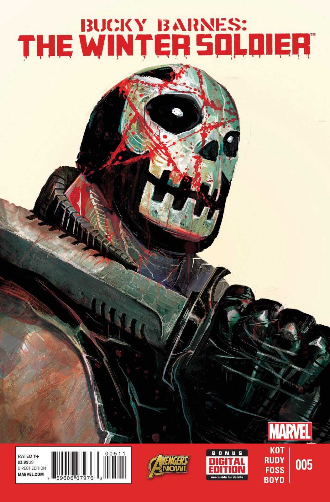
3.
All right, a little more context is required for this
one. This skull-faced bad dude is
Crossbones, a relatively minor Captain America villain who was up-jumped to a
major bad guy when he killed Captain America in the aftermath of Civil War. Since then, Crossbones has been a major threat to the MCU,
often popping up as a hands-on villain to supplement some greater mastermind, but still a credible threat in his own right. He really doesn’t have a connection to Winter Soldier aside
from killing Bucky’s best friend and mentor, which is a pretty big aside I
certainly admit. Even if
the two don’t have any personal history, this is easily the most terrifying
Crossbones has ever looked in his entire history.
You've got the guy who killed Captain America
sporting a knife that would make Crocodile Dundee say “you’re overdoing it” and splattered in blood. It’s one of the most terrifying images I can imagine. I’m actually fairly certain Crossbones
is much larger than any human could possibly get on this cover, but it
doesn’t matter because he’s so hulking and imposing, his size perfectly
fits. My favorite part is the
eyes: soulless black voids punctuated by tiny white dots. It’s an
incredibly creepy visual at the very least. I do wonder why he painted the Winter Soldier red star on
his face, yet I’m sure it made sense at the time. Actually, the idea Crossbones could take down Winter
Soldier, even with Bucky’s robotic arm and ruthless murder skills, is pretty
terrifying in its own right. He already killed one Captain America; maybe he’s going to make it
two.

2.
Okay, I may have lied earlier; this has got to be my favorite
Winter Soldier cover. Much like
cover #4, it’s a visual metaphor that cuts straight to the heart of the ideas
that informed the Winter Soldier in space series; although, this cover ties more
into the ruthlessness of the premise than the contradictions of it. However, that contradictory nature is
still present here, most notably in all the flavor ext of this gun-planet
target. There’s a great little
blurb in the bottom left about “Kill a planet, save a universe” that perfectly
sums up the whole “needs of the many” philosophy Bucky was pushing at the time
to excuse all his murder.
However, my favorite part of this cover is just that I’m an
absolute sucker for space iconography plastered over everyday objects. Stuff with planets and star
systems layered over cards, spinners, or, in this case, shooting targets is
1000% my jam. This cover was always going to make the list. I do wonder how much of this cover is
meant to be literal given that a big element of Bucky’s space adventures was
that he had access to all kinds of crazy deadly technology and guns. That way he can commit unrepentant mass murder upon an unsuspecting universe.

1.
I’ve thrown around the word “favorite” a lot in this list, but don’t be confused; this is undoubtedly the best Winter Soldier cover. It’s such an incredibly well-crafted
image that there’s no way it couldn’t take the cake. The big reason for that is how well it draws on the elements
that made all the other covers so great. You’ve got that same layering and scope as the earlier espionage
covers.
Now, it's repurposed to create this beautiful visual metaphor of Bucky going into space. I especially love the sense of depth evoked by Bucky walking down the central path of the star and out into the cosmos. Coupling that with the poster look of the star and off-white background and it’s a great metaphor for Bucky leaving earth-based espionage behind for something bigger.
Now, it's repurposed to create this beautiful visual metaphor of Bucky going into space. I especially love the sense of depth evoked by Bucky walking down the central path of the star and out into the cosmos. Coupling that with the poster look of the star and off-white background and it’s a great metaphor for Bucky leaving earth-based espionage behind for something bigger.
Additionally, this visualization of the galaxy is just
beautiful. Some people tend to get
upset by planet-heavy starscapes, but not me. It’s a beautiful range of visuals
that’s a lot more appealing and interesting than just star clusters. Most of all, I love the use of Bucky’s
red star as a container for all of space. It’s a great way to keep the icon
while giving it a new meaning. Rather than emphasizing the Soviet Union, now the red star takes on the
meaning of the cosmos and the blood Bucky is willing to shed across it.
If you liked this article, please like us on Facebook or follow us on Twitter
If you liked this article, please like us on Facebook or follow us on Twitter
No comments:
Post a Comment