

If you liked this article, please like us on Facebook or follow us on Twitter and please consider Donating to keep the blog going
It is currently the dregs of August, and there’s really nothing going on in pop culture. The dizzying high of summer blockbuster season has given away to the drippy sludge that is the late August offerings while the fall awards season has yet to begin. If there is one small bit of comfort in the pre-labor day dark, it’s that we’re entering the season of fall TV premieres, which is perfect for someone like me that clings to media topicality as a guiding light in these troubled and rudderless times.
This week will be bringing us the premiere of the latest season of The Strain, FX’s prestige vampire apocalypse show from the mind of Guillermo Del Toro (he wrote the books it’s based on.) Even though I don’t like The Strain all that much it is pretty much the only name in vampire fiction these days, thank Twilight, which means I get to talk about the biggest name in comic book vampires- Count Dracula. I’ll get more into this as we go along but for a time in the ‘70s Count Dracula was one of Marvel comics biggest success stories and today- we honor that legacy.


12.
We start relatively late in the comics life, about 4 years to be precise. By this point, Tomb of Dracula had become an established success and even spawned a supporting cast of its own that would go on to larger stardom. As such, the creators were getting a bit more experimental with the visual design of the cover, as evidenced by the perspective at hand. Most ‘70s comic covers tended to favor characters of modest scale and a binary divide of attention. That was mostly a reaction to the Silver Age’s small size and high concept visuals, this cover opts for an extreme close up view to create a much more gothic and romantic visual.
The swooning woman gives the image the look of a cheesy romance cover while Dracula is rendered in one of his most bestial looks here and those boney claw fingers are a great touch. It’s a subtle nod to Bram Stoker’s original story, which was very much a product of the Romantic Movement. While Marvel’s take on the character never delved too deeply into his romantic origins, it is cool to see them experimenting with the idea here.
11.
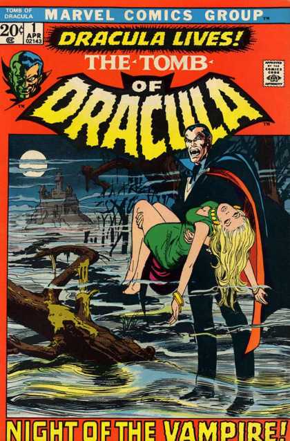
Now we go to the start of the series for a cover that’s profoundly emblematic of the shift in style and technique with ‘70s comic covers. At the time, Marvel was working to diversify their line-up of comics beyond the superhero genre. This particular cover design ended up a unique staple of Marvel’s early horror comics as it popped up again with the first issue of Werewolf By Night. The idea is meant as a throwback to ‘50s horror books when that kind of big, blocky border design was much more in vogue, though this is the only time Tomb of Dracula used this design.
It’s interesting seeing this cover in comparison to the Werewolf By Night cover it complements as they both have the same format but wildly different content. Where Werewolf By Night was a modern take on its monster, this is a classically gothic Dracula, steeped in fog, with that great looming castle, and striking the most iconic pose in all monster horror fiction. It sets a tone going forward, even if the series did end up leaving those gothic roots behind.

10.
I kind of love that in the Marvel universe vampires are SO common this random hunter guy instantly knows one when he sees it. Actually, to cut him some slack, Marvel’s Dracula tended to ALWAYS appear dressed exactly like how you’d expect Dracula to look in cartoons and things.
The design is inspired by the Universal Pictures Dracula, though altered just enough to avoid a lawsuit. The big difference is the mustache and trading Dracula’s amulet for that lacy tie thing, though even then he looks quite a bit like John Carradine’s Baron Latos character from the later Universal horror films.
As for this cover, it has one of the strangest yet most striking layouts I’ve yet seen. Covers that feature panels aren’t unheard of but they’re definitely rare and this one goes one better with that weird scope vision. It’s actually pretty in line with the Punisher’s first comic appearance, which also featured a first person scope view that punctuated the action without taking up the entire cover. It’s a unique gimmick but not terrible applicable outside a handful of situations.
I do really wonder why this guy was hunting bats out on what looks like the Scottish moors, though given there’s no question mark in his dialogue maybe he was hunting vampires all along.

9.
This is such a strange cover it pretty much only could’ve happened in the transitional era of the ‘70s. The basic design is another gothic horror style cover on all fronts. Dracula’s yet again carrying an unconscious woman in that perfect monster pose, while the graveyard setting and stormy night sky really add to the situation.
What’s more, that freaky skeleton ghoul is a great addition that manages to come off creepy without being spooky. Skeletons have a tendency to fall into the Halloween pantheon of fun scary things, but here the guy just looks unnerving, especially his pale sightless eyes.
Where things get bizarre is in the scale and proportions. Most ‘70s covers would feature characters of about this scale and try to split the focus across two central points like they’re doing here with Dracula and the skeleton. The problem is that they’re both gigantic compared to their surroundings.
Seriously look at the tombstones around the skeleton, either they’re incredibly small, or he is massive. You can tell this is before they got more into highly detailed backgrounds that fit the scale a bit better. Still, the gothic elements and really fun inter-title make up for that shortcoming nicely.

8.
Now this is a much better use of scale and perspective. For the unaware, the group of fearless vampire killers gathered together here were the Night Stalkers, a team of hunters that were a thorn in Dracula’s side throughout the series. They showed up sporadically and weren’t terribly well loved for the most part, probably their biggest achievement was introducing the world to Blade.
Incidentally, Blade is actually on this cover though you’d never know it due to the wonky lighting and coloring. He’s actually the guy talking right now, a fact you’d only be able to put together because of the bandolier of stakes on his jacket. Back in the ‘70s that was Blade’s signature look.
What I like best about this cover is the use of scale and perspective. The downward viewpoint is a relatively unique angle in and of itself but the way no one is fully on page is a really innovative approach for the time. As I said, this was just the beginning of creators starting to adopt larger and more detailed visual designs so opting for such substantial detail and shadow here, to the point that everyone’s too big to actually fit, is a really impressive feat.

7.
Another gothic cover and one that features that same approach to scope and perspective. This comes from late in the comics run, much like #12, so it makes more sense now that they’d engage in this kind of visual. That’s not to say this cover is less impressive, just that’s impressive for different reasons. Featuring one guy that’s too big for the cover was a pretty standard twist, though we do get a good look at the way Dracula’s cape became more and more ridiculous as the comics went on.
No, what really sells this cover is that incredible background, and I don’t just mean the really trippy pink psychedelic design. However, on that note, this was around the same time Dr. Strange was becoming a cult hit with the psychedelia scene so I wouldn’t be surprised if this design was a purposeful style for the trip out crowd.
The design of the skull moon is also incredibly striking and one of the better realizations of that idea. A skull in the moon is fairly basic as a horror trope but having it made up of these moon crater blots is a great little addition. The crumbling, overgrown cathedral with bats swarming the belfry is also very well rendered, if a lot more subtle than the loud background and hovering death moon.

6.
Now we’re getting into the weird stuff. This cover is a lot more in line with what most of the Dracula comic was like- bizarre high-concept nonsense dressed up the glossiest art the ‘70s could provide. Firstly, going back to the issue of scale, this is a much more ‘60s sized visual, especially with how many characters have managed to get on panel.
Between the scale, weird concept, and the speech balloon this could’ve easily been a Silver Age cover if things were just a little more pulled back. Restraints like not showing the full Zeppelin or all of the soldiers speak to the ‘70s origin.
I think my favorite part of this cover is the inter-title claiming this is Dracula’s “invasion of America.” Just the idea that 1 lone guy, jumping out of this random blimp that no doubt took forever to get him across the Atlantic, is all the invasion force that’s needed to conquer the entire US.
I mean, okay he’s a vampire, I’ll grant that, but some old coot with a hunting rifle took him out in one of the previous covers, I get the sense the US military can probably take him. And even if they couldn’t, he’d still have to fight the X-Men, Avengers, and Fantastic Four but that’s a story for a later cover on this list.

5.
Now that’s more of an invasion force. If Dracula showed up on the shores of the US with a full on zombie army, I’d be more inclined to take the vampire threat seriously. Actually, thinking about it, I’m not totally sure these so-called “hell-crawlers” count as zombies. They’re animated corpses, certainly, but Dracula describes them as a vampire legion, which would imply a very different thing than zombies. That probably has more to do with the time this comic came out.
It was still the early ‘70s when Dracula was being published, so the concept of the zombie horde was only just coming into popular consciousness. Marvel actually had a zombie book at the time as well, Tales of the Zombie which I covered back in 2015, but that was more about voodoo zombies and such. So Dracula’s army being zombies in everything but the name makes a bit more sense though I’m not exactly clear on why he’s been made to look so pale and sallow here.

4.
This is such a fantastic blend of visual elements I’m hard pressed to think of how it even happened. Firstly, the idea of pitting Dracula against another force for evil is actually a fairly common one. Dracula is one of those number zero instances of an instant horror cultural phenomena where the character gained widespread popular notoriety as a shorthand for evil. As such, he’s been pitted against equally vile forces almost since the beginning, most famously when he faced down Jack the Ripper in a newspaper comic during the killings. What’s more interesting to me is the evil he’s facing down here.
The guy isn’t actually a character just a stock Satanist, as evidenced by the robes and horned mask. That’s actually a very sly bit of commentary as Satanic Panic horror was the wave of the future in the ‘70s as the horror-exploitation of ‘60s revivals was fading off. As such, having Dracula, the figurehead of ‘60s horror like the works of Hammer studios, face down with a shotgun-wielding Satanist turns this into a great battle of the subgenres. Finally, this is the only cover to feature Dracula actually using his most mercurial power to turn into mist, despite it looking incredibly rad.

3.
Okay, this cover isn’t actually that well illustrated but it’s a conceptual masterstroke, and that dialogue is just incredible. This is probably the clearest look we ever got of Dracula in these covers and looking it over there’s a good reason for that. I understand the need to put him in the formal wear costume for branding, but it does look mighty silly to just have him traipsing around in a full suit and cape. Really, the colorist is the star of Dracula’s appearance as the blue/black blending on his design walks a fine line of looking imposing without letting him blend too much into the inking or the background.
Really, though, the whole reason this cover made this list is because of the creepy idea of Dracula enticing children into his evil scheme. This touches on another of the Count’s multitude of powers- hypnotism. Actually, the scary blank-eyed killer kids and Dracula combination makes this a stealth crossover of Dracula and the Children of the Damned, two of the larger horror icons of the ‘60s. Honestly, though, this cover’s spot was secured with that line ‘The child is the slayer of man,” it’s just too perfect a villain line to let slide.

2.
The Blade of the ‘70s was a different person than the Blade of the ‘90s. This is probably the most iconic image of the entire Tomb of Dracula run, even accepting that there was an anime based off these comics (but that’s a story for another day.) A lot of that has to do with this being the cover most in line with the developing style aesthetic of the 1970s.
Firstly, the scale of Blade and Dracula is perfectly sized for a ‘70s cover, with both men taking up roughly equal space while also filling the cover. That was a relatively new innovation and coupled nicely wit the idea of splitting the page’s focus between two key points. Add in the very warm color binary between Dracula’s red and blue and Blade’s brown and green and it fits perfectly into the ‘70s aesthetic.
All of that is the meat of why this cover endures but the real reason it was rediscovered is Blade himself. Partially that comes from the success of Blade’s film trilogy and TV show, which honestly still stack up as one of the best vampire fighting franchises out there. Moreover, Blade is still one of the only black characters in all of vampire fiction so placing him front and center like this really highlights how unique he is.
It’s much the same reason we still kind of treasure Blacula as a charming relic of a previous age despite its flaws. Incidentally, for the curious, Blacula came out one year prior to this cover and there’s yet to be a team-up of the two characters, which strikes me as a real shame.

1.
I told you we’d get back to Dracula fighting other Marvel heroes and this is a real doozy of a battle. I’m actually a little unclear of where this fight is taking place, mainly because we’re seeing it from a really weird perspective. From what I can tell this is a castle, though the color work sure doesn’t convey that too well, and we’re looking at some kind of balcony from the side. Look, regardless of where this is taking place, it’s absolutely awesome on every level.
Silver Surfer is still one of Marvel’s coolest characters of all time so anywhere he shows up automatically gets better, especially since he brought his logo and speech balloons with him. What I really love about this, though, is that Silver Surfer, a guy who brought Galactus to Earth, describes Dracula as the most deadly horror the world has ever known. That is an incalculable level of pure evil right there, and the very situation speaks to why Tomb of Dracula proved so popular.
Before this, Dracula as a character was in kind of a weird limbo. He had been re-introduced to the masses through the Universal films and then again through the Hammer Horror movies but he just existed as this bizarre, throwback boogeyman everyone knew but wasn’t really afraid of. Tomb of Dracula morphed the character into more of an archetypical super villain with massive evil castle headquarters, helpless pawns in his thrall, and had him go head-to-head with some of Marvel’s greatest heroes. That’s what Tomb of Dracula was, a villain book, and a damn good one at that.
If you liked this article, please like us on
Facebook or follow us on Twitter and please consider Donating to keep the blog going
No comments:
Post a Comment