

If you liked this article, please like us on Facebook or follow us on Twitter and please consider Donating to keep the blog going
And so the celebration of Wolverine’s latest film adaptation comes to a close in the only way it could: a dive into the comic book covers that have made him such an icon over the past 40 years or so.
Curiously, however, despite being one of the handful of characters who could keep Marvel Comics afloat all by himself Wolverine’s cover offerings are a little less than robust.
There are certainly some excellent entries and iconic additions but for the most part, Wolverine comics tend to filter through the same handful of shouting and stabbing poses ad nauseam. Given that, this is going to be a shorter list but one with a greater eye towards history and iconography.
After all, Wolverine is one the biggest characters in all of the comics, a franchise unto himself with a visual language steeped in a long history of unique genres and definitive visuals and we’re going to check out 8 of them right here.

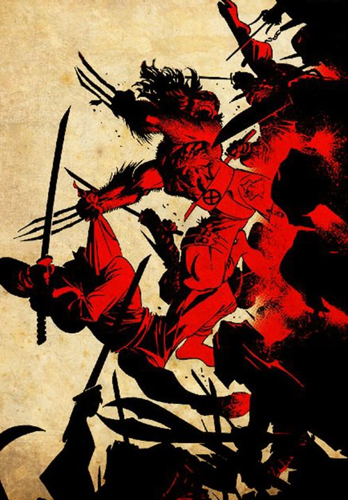
8.
We start our list with the aesthetic that propelled Wolverine from popular hero to unstoppable moneymaking juggernaut. This is the ‘80s, gritty ninja fighter Wolverine that came up around the same time as Frank Miller’s run on Daredevil. The ‘80s was the decade of the ninja so just having them around was always going to be a big win but this cover sums up why Wolverine works so well in the ninja/martial arts genre. See, ninjas actually aren’t terribly interesting in a solo manner, they’re only really compelling when you’ve got a huge horde of them, they’re basically gritty urban answer to Stormtroopers.
So, contriving a reason to throw an unending amount of black pajama suited ninjas at an unkillable murder machine like Wolverine was the perfect blend of violent gore and indulgent action, as summed up nicely here. It’s literally a tied of ninjas sweeping through Wolverine as he slices and dices through them, that’s the most indulgent vision of this concept I could imagine. I especially like the way the blood splatter from the ninjas is used as the sole source of light and color in this scene, shades of Kill Bill Vol. 1 yet somehow less restrained.

7.
This is definitely one of the more iconic covers on the list though it’s got an undeniable charm to it. I don’t usually go for static poses as cover art, especially if they feature block color backgrounds like this one but this is a rare exception due to context.
As you may have picked up, Wolverine appears to be wearing an eye-patch in this scene while the gray Hulk next to him is stuffed into an uncharacteristic tuxedo. All of this was completely vexing to readers at the time, which basically makes this cover an ‘80s equivalent of the Silver Age style of cover where something weird and out there is happening to try and draw in readers.
I also really love the use of the white tuxedo top costuming, which is a deliberate reference to Casablanca. This whole story arc was about Wolverine working security in Madri Poor, a made-up nation that basically served as Marvel’s own little Casablanca- a criminal port of call full of gangsters, ninjas, and a weird version of the gray hulk called Mr. Fix-It.

6.
Ah, Wolverine’s first ever appearance where he was touted as Canada’s first and best hero. I don’t know if I agree with the “best” part of that but I do love that that was his initial claim to fame, just being someone super from Canada.
Incidentally, having him originate in the pages of Hulk has more or less intertwined these two characters throughout all of Marvel history, as we saw in the previous cover and the pages of Old Man Logan. You can tell this is a cover from the early ‘70s due to the mismatched approach to scale.
Wolverine and Hulk are drawn very large and detailed in the forefront, the way that would come to define the decade, but the background detail is all curious small. The Wendigo had to be scrunched down into the bottom corner of the page to fit, though he at least got his own arrow.
Still, even with the transitional aesthetic of the cover, this is a great central image and the pose has become truly iconic in the industry. Every Hulk v. Wolverine fight to ever follow this has used this image; it’s part of the language of comics forever.

5.
This is such a bizarre little cover, one that’s actually steeped in a lot of deep comic lore, but I absolutely adore it. The image of an American flag across a human face is one of the most evocative symbols in the modern canon and only gains added depth here given Wolverine’s Canadian origin. If you’re wondering about that, the reason he has the American flag on his face is that the project that bonded the adamantium to his bones was run by the Americans, a fact which adds a certain layer of weight to this visual. What’s more, the visual of the flag facemask is also the symbol for a Marvel villain called Nuke, a government super soldier project gone wrong who also appeared in Jessica Jones.
It’s a unique case where the image all by itself is very different from a version of it informed by comic history. Without the back-story that Wolverine is a Canadian victim of American super soldier experiments that produced other murderous misfires it almost looks patriotic. Adding those elements into consideration the cover has a much more menacing aesthetic to it, which fits well into Wolverine’s ongoing struggle against the US government.

4.
I honestly don’t think any character can make a static close-up shot look more dynamic and iconic than Wolverine. Seriously, like ½ this list is just Wolverine looking at camera but they’re all foundational images of the medium and instantly recognizable like this one. This came from the first attempt to explore Wolverine’s origins in the pages of Marvel Presents, an anthology type book that Marvel really needs to resurrect.
Obviously, the visual design of Logan’s Weapon X look has become monumentally influential but I think a lot of that has to do with the very creepy and harsher visual design here. This cover marked the dawn of the ‘80s for comics in a lot of different ways, chief among them is a willingness to feature the kind of physical gore the medium has shied away from previously.
Wolverine is covered in blood in this image, which is honestly pretty disturbing. It highlights the fact that his claws are slicing through his body every time they come out, something that had never been directly addressed in the comics before. Also, his weird cyber-helmet is pretty evocative in its own right. It’s a dehumanizing kind of look that really puts the WEAPON in Weapon X. He looks like a monster created solely for murder- I’d say there was no kindness in his eyes but he doesn’t even have eyes to look for kindness in.

3.
Another Wolverine Origin cover that’s so good it ends up obfuscating how disappointing the comic actually was. Seriously, Wolverine Origin is the comic that made creatures stop wanting to explore Wolverine's origins along with the one that said he was descended from a race of wolf/dog people. In any event, this cover is god damn amazing for all the reasons I just stated only more so.
It’s got a real spooky, agrarian horror atmosphere to it fostered by the burnt orange background that I really like. Wolverine may be a superhero but there’s a lot about him that feels like it’s drawn from a horror movie, especially the very creepy nature of his powers and his origins in the Canadian wilderness.
This cover highlights all of those scariest elements, specifically the body-horror nature of his claw powers. I mean, usually when a bone sticks through the skin it’s horrifying, we just give Wolverine a pass because his bones are metal.
This cover strips that protective sheen away for the true horror underneath and I really love the look of the black, scratchy blood that’s achieved here. Admittedly it looks kind of like Wolverine is being infected by the symbiote but I’ll let that slide because it’s creepy and adds to the unsettling aesthetic of the cover.

2.
For one of the defining Wolverine covers this one is shockingly haphazard in its construction…and yet it just kind of works, it’s pretty flabbergasting. I think a lot of it has to do with the fact this cover works more on feelings than facts, in that everything about the visual design has the exact right feel even if the actual dimensions don’t add up. Wolverine giving the reader his best “come at me, bro” smile combined with the claws is such a delightfully energizing image it doesn’t matter that the hands are weirdly small or that his shoulders are massive in this close-up.
This was the comic that told Marvel Wolverine could hold down his own books and didn’t need the X-Men to back him up, basically upending everything editors thought they knew about the appeal of tiny, hairy, Canadian men. I especially like the odd angle his claw hand has to be at to show us the back of his fist and the side of his blades. I also question if everything behind him is supposed to be on fire based on that weird gradient.

1.
Remember how I said earlier Wolverine’s always had a kind of monstrousness to his character that is underplayed by his superhero nature? Well, none of that is present here. This is Wolverine freshly after the Weapon X experiment and it’s easily him at his most dangerous.
Everything even remotely human about Logan has been wiped away here, he’s a predator loose in the cold wilderness and that’s just so perfectly captures. I love the interplay of light and show in this piece, it gives the distinct aesthetic of a world beyond the touch of humanity, somewhere truly remote and isolated and on the edges of reality.
The coloring is the real star, especially the light hints of blood on Logan’s hands from the experimental plugs and unleashing his claws. Even his hair is well rendered, this massive wild main that engulfs his entire head. He looks like a Wendigo emerging from the depths of the Canadian tundra, a beast made of rage, which has always been an emotion at the core of the fantasy that is Wolverine. He’s a character who gets supremely angry but has the power to actually do something with that anger and here we see him at a point where the anger is all he is.
If you liked this article, please like us on
Facebook or follow us on Twitter and please consider Donating to keep the blog going
No comments:
Post a Comment