

If you liked this article, please like us on Facebook or follow us on Twitter and please consider Donating to keep the blog going
This weekend the world lost a titan of illustration and horror- Basil Gogos. Gogos was one of the fundamental names in horror artwork; his style was unique and widely influential in a way that few others have ever managed. He’s also one of a lot of artists that don't get brought up nearly enough due to how much his work was instrumental in defining a previous era. Gogos’ greatest volume of published work with the farthest reaching impact was unquestionably his huge collection of cover art produced for Famous Monsters of Filmland.
Famous Monsters was a horror/monster/schlock magazine that first saw print in 1958 and basically invented the horror movie subculture. In the days before the Internet stuff like Famous Monsters was the only way horror fans could interact with other fans or even get a hint of the horror landscape beyond their own personal borders and it helped inspire a lot of fans turned creators over the years. So, today we honor a great man and his great legacy with the top 15 Basil Gogos covers of Famous Monsters of Film Land.


15.
The first thing to understand about this list is that’s it’s entirely made up of pre-existing subjects. That’s just how Famous Monsters worked- it was a magazine dedicated to upcoming horror films or classic releases above all else. In this case, the subject is Universal’s vision of Mr. Hyde, played by Fredric March in the 1931 version of the film. This is a great introduction to Gogos’ style of artwork, a blend of hyper-realistic detail with deeply unnatural lighting and color work.
The details on Hyde’s slacken cheeks and withered eyes are deeply unnerving but I think what really brings the horror is the row of teeth jutting from his upper jaw. The look, which was developed by effects master Wally Westmore, was intended to give Hyde a lower, less evolved appearance as a way to visual someone’s repressed evil and that definitely comes through here.
At the same time, there wash of colored light across his face is very unsettling. There’s a sickening kind of look to the green light across his lower jaw and the mauve coloring in his hair. It all adds up to a deeply inhuman mood layered over an all too human monster.

14.
Covers like this are part of why I love Famous Monsters. If you don’t know, the vampire on the cover is Barnabas Collins, the star of the Gothic Horror soap opera Dark Shadows. The show had started out as a standard soap opera but for reasons seemingly lost to history transitioned into a spooky series including ghosts, black magic, and more.
The real star of the show at this point was Jason Frid’s Barnabas Collins and together they became an enduring cultural phenomenon. It was an especially popular hit for the new generation of school-aged monsters fans growing up in the ‘60s with nothing to do in the afternoon- hence Barnabas showing up in this mag.
What I really dig about Gogos' work here is how there’s exactly zero concessions made to Barnabas’ character as a more heroic vampire. In the show, he wasn’t exactly good but he did have a moral code and it was understood he was our hero. Here, he looks like he’s going to tear your throat out.
You can see a lot of the same techniques with Hyde on display here, especially the heavy texturing on Barnabas’ cheeks and the green lighting to contrast the red background. I also really like the chunky finger design, it reminds me of Jack Kirby’s art.

13.
This cover comes from The Cyclops, a not terribly great 1957 B-movie notable mainly for being one of the later roles for Lon Chaney Jr. and one of the many American giant monster movies from producer/director/writer Bert I. Gordon. What’s notable here is that Gogos’ vision of the Cyclops is even more grotesque and gruesome than in the film. That gaping eye socket just staring out at the reader is very creepy I love the cracked look of the flesh giving way to bone around it. Again we have texturing of the visual but it’s a very different kind of texture.
There’s none of the ruddiness of the previous faces but instead, it looks more like clay that’s cracked under a great heat. Even the green light finds a very different visual appearance here, playing in the lines of the face rather than contrasting with the background. I especially like the shadow cast by the bridge of the Cyclops’ nose, that’s a great subtle detail. What I think really makes this cover so eerie, though, is that one good eye. There’s a human intelligence behind that eye but no hint of caring or sympathy, just cruelty.

12.
This terrifying grinning creature is Mr. Sardonicus, from the film of the same name by ‘50s sultan of schlock William Castle. Despite the imposing visual Mr. Sardonicus is a pretty weak film and signaled the end of Castle’s dominance as a force in American cinema. Still, this is one of those images that’s always going to stick with you and the movie being kind of forgettable just adds to it. You don’t need to know the back-story of Sardonicus to find him utterly terrifying as this cover so neatly proves.
This is the first time Gogos has abandoned the green lighting altogether in favor of a stark white light thrown across half the figure. I really dig the way the light ends just bellow Sardonicus’ eyes, casting his upper have in shadow and giving the air that is smile is where the light’s coming from. Speaking of that smile, teeth are pretty much the perfect medium for Gogos’ heavily detailed style to create some real horror.
What I really like about this cover though is the very unnatural look of Sardonicus’ skin. It’s not just the ruddiness of the texture, it’s hanging on his face wrong. I think this might be an attempt to capture the look of the Sardonicus make-up from the film but it looks like he’s wearing a skin mask, especially the loose, stretched out look of the skin around his chin and lips. I do note that Sardonicus’ eyes have a much less cruel look to them, but there’s still an intensity there that puts me on edge.

11.
If you ever look up the word ‘Gruesome’ in the dictionary you’ll probably find this picture. It’s inspired by the 1953 Vincent Price horror film House of Wax, which was later remade in 2005 despite itself being a remake of the 1933 film Mystery of the Wax Museum. It was the first color 3-D feature made by an American studio and was re-released in the ‘70s and ‘80s, basically keeping it alive in the horror-sphere and eventually landing it a spot in the library of Congress in 2014. The character here is Vincent Price’s role from the film, a wax sculptor who’s burned in a fire and unable to sculpt anymore so he coats people in wax to be his creations.
Even though this cover is inspired by the film it’s actually INFINITELY more grizzly than the movie. Despite being a major studio release House of Wax was still basically a junky B-Movie without a huge make-up budget so the effects are pretty of the time. This visual of Price’s hideously burned, Phantom of the Opera looking face is largely original and completely horrifying. Again you have the heavy use of texturing for the design and again it’s taken a different turn, this time emphasizing a twisted, contoured look like exposed muscles.
I really love the use of purple and orange tinting to give the thing an inhuman vibe, also that deformed ear is chilling. Of course, Gogos managed to get some teeth in there, which are appropriately creepy though the strands of burned hair have an unsettling quality all their own. This is a very different kind of monster for Gogos, one that looks less physically threatening and more existentially so, which again comes out really well in the eye. The bloodshot Iris and slope of the brow give it an almost pleading look that fits the disfigured face so well.

10.
Hell yeah, King Kong made it onto the cover of Famous Monsters of Filmland, I mean- what monster is more famous than the King of the monsters? This was actually an issue meant to tie-in to the first remake of King Kong by Italian mega-producer Dino DeLaurentis as part of his obsession with topping Jaws at the box office. The cover actually came out two years before the movie because it was a bloated production mired in legal battles from the word go but this visual is still pretty great.
It’s actually meant as a sketch of the remake’s biggest hook- that they had built a 50-foot King Kong robot. They had originally claimed the robot would be used for the entire film but ultimately just used it for stationary shots of Kong’s hand and face, because it didn’t really work, but this is a pretty good recreation of that face.
This is probably the most natural looking application of Gogos skill at skin texturing as the leathery look of Kong’s skin actually fits that of an actual gorilla. Again we have a lot of tricks being employed for the lighting, with the amber glow softening the furry side of Kong’s head while Gogos’ favored eerie green glow covering his eyes and skin. Probably the best part of this is the red glow around Kong’s fangs and snout. It almost looks like the title is lighting up his mouth and it gives him a very savage look. That’s a look definitely enhanced by the wild eyes, it’s an animalistic cover in all the best ways.

9.
This is such a strange cover yet probably the best example of the actual breadth of Gogos’ skill. This is Herman Munster, patriarch of The Munsters, though I think the cover’s claim that they’re “America’s First Family of Fright” is an overstatement. They were a ‘60s monster family sitcom that came out in the wake of The Addams Family’s popularity. I couldn’t find any information on why this cover would feature him as it’s from well after the show ended but, like a lot of high concept ‘60s sitcom families, I suppose The Munsters never really went out of fashion.
This cover’s a study in contrast with the Barnabas Collins’ cover from #14. Where that cover was thoroughly horrific and creepy, this one has adopted a much more jovial style and tone to it. There’s like a hint of creepiness in the blend of Herman’s smile and his kind of wild eyes, especially as you can only really see the one, but it’s just a hint. For the most part, it’s just a very realistic recreation of the character who looks very friendly, an idea that’s pushed the most by the use of light and color.
This is the first time Gogos’ has ditched the green lighting altogether in favor of a warm orange that blends nicely with the yellow background. Even the usually skin texturing is gone in favor of smooth contouring with the blue-gray and mauve make-up colorings. It’s just a much more intentionally silly and fun kind of image than we’ve seen from him and shows there’s more he could do than just horror monsters.

8.
Another cover starring Vincent Price, this time from the film Madhouse. The 1974 release was one of a handful of late releases for former horror stars that played on the idea they were stars, similarly to 1968’s Boris Karloff feature Targets. I think that’s why Gogos is going for such an old and embittered look to Price on this cover. It reminds me a lot of the House of Wax cover in that the monster on hand doesn’t look menacing in an immediate or violent sense. Price here looks like the literal specter of death and that’s before even getting into the make-up. We’ve traded the ruddy or gruesome texturing for something much more corpse-like.
It’s a great blend of the face’s natural wrinkles with the cracks and crevices of a greasepaint mask that adds to the ancient vibe. Also adding to this is the massive spaces between his teeth. Combine that with the burning red outlines over the eyes and the kind of slacken, flat look of his hair and he really does look like a living corpse. The black make-up around his nose, mouth, and eyes just adds to this, giving the face a rotted characteristic. Even though this cover has the least amount of lighting used, it’s definitely one of the most impactful and frightening.

7.
A cover like this makes me really wish Gogos had done more sci-fi work in his career because I absolutely LOVE the way he’s rendered the fiendish hands of Orlac. This issue seems dedicated to the number of times the story The Hands of Orlac has been adapted but the cover itself is drawn from Karl Freund’s 1935 adaptation Mad Love.
This pose is actually drawn directly from a promotional still for the film, only with a greater degree of Gogos’ signature hyper-realism. It’s interesting to have a cover by him that swaps out the face focus for a focus on the hands but it really works.
The heavy amount of detail put into the artificial hands is really striking and the light effects employed to make them gleam on the cover are absolutely spectacular. It’s got a real shiny, sci-fi, chrome look to it that contrasts nicely with the dark, gothic design of the rest of the cover.
The way the red background blends into Orlac’s jacket on the left side through the lighting effects is downright hellish and adds to the very German vibe of the design. That blend of creepy technology and impressionist gothic horror was a big part of the classic German horror scene that Karl Freund came from and Gogos really captures it here.

6.
This is interesting- a cover tied to a film that’s never actually been seen. The film, London After Midnight, is a famous lost silent film starring Lon Chaney, the star of The Hunchback of Notre Dame and Phantom of the Opera silent films. He was known as “the man of a 1000 faces” and, despite not surviving into the future, this one might be the most terrifying face of all.
If you look in the upper left-hand corner you can see Lon Chaney’s face from Phantom of the Opera was used as Famous Monsters’ insignia for years, which tells you the caliber of old-school horror geek that produced this magazine. When this cover was released in 1970 the last prints of the film had already been lost in a fire in 1964 so magazines like this are pretty much the only way knowledge of the film managed to spread and thrive.
This is another great example of how well Gogos’ style can contrast types of horror with just a handful of details. The actual look of Long Chaney on the cover has the same kind of old and decaying aesthetic as Vincent Price’s two covers but there’s none of the tragedy they had. This is a monster, pure and simple and what it really comes down to is the facial expression. That gleeful smile, full of rows of razor sharp teeth, and the completely inhuman and red and black eyes just look thrilled to do you harm.
All the little details of age like the loose, slacken cheeks or the cracked and wrinkled rings around the eyes are turned into a menacing, twisted, visage here. We also have the return of the colored light techniques in this very bizarre yet striking violet/white/green split. I’m not sure what that’s meant to impart or evoke but it looks really cool so I’m on board.

5.
You better believe Famous Monsters had Star Wars issues. This was part of the series’ broadening its own scope to try and adapt to changing times. They didn’t have Gogos’ cover so I didn’t address them but there were also covers relating to other schlock films or things with a lot of make-up and special FX like Planet of the Apes, Westworld, and Close Encounters of the Third Kind.
This cover is still pretty unique though as it took the bold decision to make its Star Wars tie-in looking god damn terrifying. Seriously, the Tusken Raiders were always kind of menacing in the films but seeing one with this much detail is supremely creepy, a real triumph for Gogos.
A big part of that creepiness comes from the way Gogos textures the Tuskan bandages. He looks more like the Mummy than anything else and the bandages have a rotted kind of look that puts me in mind of something way more organic. The whole thing just looks wrong, like a creature that wants you to think it's human but isn’t quite pulling it off, and that’s just the head shape and bandages.
The soulless black eye sockets and weird electrodes jammed into its head are pretty off-putting but that breathing apparatus is really unnerving. There’s something about the dark, organic design of it that complements the bandaged look perfectly. There’s no direct correlation for how you would describe a human face, just something truly alien and soulless.

4.
Well this is a bit of an odd one, a cover tied to a film that was never actually produced. As you can see in the headlines this cover was meant to connect to a new Phantom of the Opera film, a sequel to the Claude Rains adaptation, hence him appearing on the cover. That film, entitled The Climax, was eventually released but not as a Phantom sequel, as Rains was unavailable to return for the project.
Honestly I’m not that surprised, Rains’ film was one of the least rewarding adaptations of the Phantom, right alongside the Gerard Butler adaptation. The big problem with the film was that the Phantom just wasn’t scary, which is why this cover is so impressive because he is damn creepy here.
I’m hard-pressed to say what exactly is so unnerving about this vision of the Phantom but I think the big thing is the design of the mask. It’s got a much more inhuman and exaggerated look to it here than in the actual film. The way the mask engulfs his face and the strange eye patterns remind me of an alien and the muted look of the nose really helps with that. Also the face underneath is pretty distressing in its own right.
There’s a tiredness to the Phantom’s eyes here I actually quite like, it’s a pitilessness that his shrewd lips, wrinkled skin, and wild hair complement nicely. Then of course there’s the excellent use of lighting to give that bright streak of orange down the middle of his mauve mask. It’s a cold vision of the Phantom with very little romance.

3.
We’re going old school for this trio of covers and I can’t pretend the subject matter isn’t a big part of pushing these guys to the top spots. I grew up on Universal horror movies so I’ll totally roll over for the Gillman and friends. This is actually a fairly unique rendering of the creature from the Black Lagoon as he has a more confused, animalistic look than usual.
The creature was always one of the more menacing Universal monsters, there was no hint of tragedy to him like Frankenstein or the Wolfman or even the Mummy, he’s just a murderous creature that kills whatever enters his world. This cover does a lot to give him the wide-eyed look of a startled animal, especially with the use of light reflection on his one eye. It gives the pupil an oversized look that, combined with the suggestion of drool by its mouth corner, makes it look almost zombie-like.
The texturing on the skin of the creature is a pretty interesting moment for Gogos as it’s one of the few times his offering is working from pretty much the same set-up as the make-up designer. This isn’t much of an embellishment from the creature’s actual costume, especially with the massive amount of ridging detail on the nose and gills.
The real big change is the coloring, trading the standard all green look of the creature for a blend of sickly yellow and steely blue I really like. There’s a gradient to the image as it works its way through light green into artificial yellow and settling into a murky blue- it’s a striking design.

2.
Here’s another design that doesn’t deviate that much from the origin, which is arguably the most iconic monster look of all time. Frankenstein was the face of the Universal monsters as much as Dracula and this design of the sallow green skin, flattened head, and neck bolts has become the universal vision of the famous monster.
Much like the creature, Gogos here is allowing the design to speak for itself, making his input in terms of heightened detail and setting. For instance, this is the cover with easily the most straightforward set-up to its lighting, shedding the normal colored light and other tricks for a basic single beam. It creates a great shadowing effect across the monster’s face that’s very subtle but also extremely gothic.
Gothic really is the word for this cover, especially with that ornately designed candle in the background and the misty red backdrop. As for the monster himself, Gogos does a great job weaving the nature of the make-up into a more misshapen kind of look. The cracking, molding look around the monsters mouth, cheeks, and lower brow are the result of caking on layer after layer of make-up but here it really adds to the corpse vibe of the creature. I also like that the flat head and neck bolts aren’t too pronounced, he’s a monster but he’s still got his dignity.
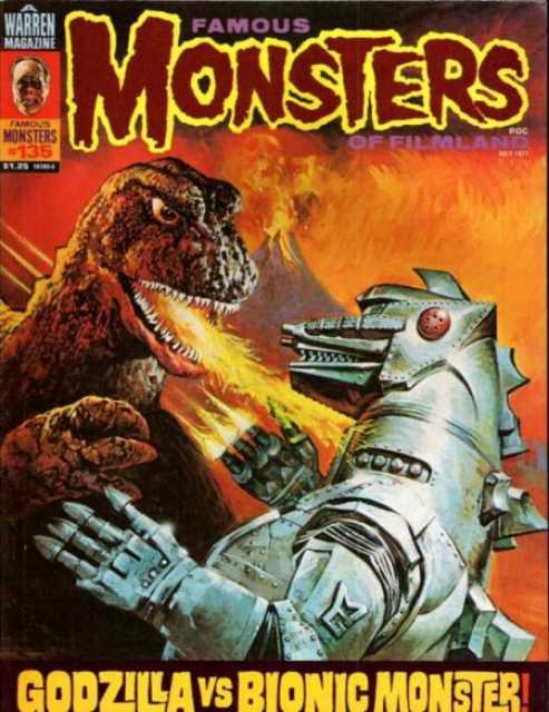
1.
The magazine is called Famous Monsters of Filmland and you really can’t get anymore famous than Godzilla. Everyone knows Godzilla, everyone can’t help but know him. Even people who don’t know Godzilla know Godzilla, to the point that when he died in the ‘80s it made the news in the USA despite the film not being shown here. As such, I found it fitting that the #1 spot go to the King of the Monsters, but more than that this is the only Goros cover to actually feature character in action rather than just leering at the reader and I love it. None of the scale of his other covers is lost here at all, both figures are still completely titanic but there’s so much more than usual going on in this scene. Godzilla’s breathing fire radiation down onto Mecha-Godzilla, who’s responding with finger beams, while in the background a massive volcano is going off for no clear reason- it’s awesome.
It’s such a dynamic pose it’s amazing that none of Gogos’ detail is sacrificed as a result. The biggest shift is probably in terms of lighting but even then Gogos works wonders with the shift from white-hot lighting on Godzilla's left to smokey red and orange on his right. The texturing is absolutely top notch as well and creates a great contrast between monsters. Godzilla’s skin is all rocky, vulcanized plastic similar to the volcano behind him while Mecha-Godzilla is glimmering brushed steel and hard edges. It’s the only cover in the bunch I found that truly tells a story and shows off just how much Gogos could back into a single image.
If you liked this article, please like us on
Facebook or follow us on Twitter and please consider Donating to keep the blog going
Hey, sorry to be that guy.... but #13 (issue #53) is of The Colossal Beast (The Amazing Colossal Man sequel) from the 1958 Bert I. Gordon film, War Of The Colossal Beast, not the 1957 Bert I. Gordon film, The Cyclops. It's been eight years since you published this, so I'm assuming that a hundred other horror nerds have already set you straight on that point.
ReplyDelete