

Edited by Robert Beach
Last Friday marked the premiere of the Deadpool movie. I haven’t seen it yet, but the early buzz is very positive, and it’s apparently on track to be one of the biggest hits of the year. Personally, I’ve never been a huge Deadpool fan, though I’m not going to begrudge anyone who does enjoy the merc with a mouth’s antics.
He’s a hyper-active, unkillable lunatic with complex relationship with self-awareness. Having seen Freakazoid, Bugs Bunny, and the Mask, I get why that would be popular. Given that Deadpool’s had a number of comics through the years, and I run a cover blog, let’s dive into the shallow end and get the cover story on the top 15 Deadpool comic covers.


15.
We start with a cover to set the mood going forward. I mentioned above that Deadpool is cut
from the same cloth as folks like Bugs Bunny and Freakazoid, and this cover is
directly in that particular wheelhouse. In fact, the “joke” of Deadpool being so incredibly secure in his own
masculinity that he can break all kinds of gender norms has become a pretty bog
standard Deadpool gag all around. And this is as pure a visualization of that
joke as you can get.
This cover
also does a good job summing up the kind of whackiness that Deadpool sells: a simplistic, almost classical, approach to basic and instant visual gags
that appropriate a childish sensibility to counterbalance Deadpool’s
hyper-violent nature. Add on the
element of the now semi-dated pop culture reference, and this is about as pure and
simple a Deadpool cover as you can get.

14.
First things first: points for giving us a cover that
features speech balloons. I remain an absolute sucker for that kind of
thing. Now, let’s talk about why
this cover is absolutely delightful. That giant moon face thing Deadpool is carrying on his back is Ego, the
living planet, one of the crazier aspects of the Marvel cosmic universe and
allegedly the central threat in Guardians
of the Galaxy Vol. 2.
That obscure reference blended with the incredibly irreverent style here is
another example of classic Deadpool. Incidentally, in case you think that face is an affectation limited to
Deadpool’s whack-y world don’t, Ego actually does have a giant face; it’s just
he doesn’t normally drool on people. All of that combined with the absurdist cartoon-y nature of Deadpool holding
up the planet like he’s Atlas make for a very fun nod to the classic
stuff.

13.
So obviously these will not all be comedic comic covers as
some, like this Axis tie-in cover. Some are pretty excellent as simple cover art.
Axis is a forgotten 2014 event
wherein a bunch of heroes and villains had their moral compasses inverted; good
guys became bad guys and vice versa.
In the case of Deadpool, he morphed from whack-y cartoon murderer to
thoughtful Zen pacifist.
For its
many terrible aspects, Deadpool as a Zen master was a brilliant idea, and this
cover is the perfect visual metaphor for that dichotomy, showcasing the two
competing Deadpool costumes between classic and meditative as back dropped by
that great blood splattered Yin Yang symbol. I really love the way peaceful Deadpool wields a rock garden
rake. That’s hilarious. The
only real problem with this cover is the titles. That Axis title in
the upper corner is really out of place and in no way balances out the shrunk-down Deadpool title in the left-hand corner. It's still a great cover though.

12.
Jumping from one forgotten event to a relatively forgotten
branding exercise, this cover ties in to Marvel’s Dark Reign emblem. This was a several month period in which all Marvel heroes became
illegal, and Norman Osborn and several fellow villains took over the role of
America’s protectors. It was a
weird concept that we don’t have time for. Just take my word when I say this
cover is spoofing on Daredevil's villain Bullseye. Now that we’ve covered the reoccurring trope of Deadpool’s
connection to crappy event comics. Let’s move on to the reoccurring trope of
Deadpool suffering horrendous injury.
The idea of Deadpool as a sponge for pain is fundamental to
his character and the base comedic identity that’s formed around it. The fact he can endure so much
punishment but keep coming is what led writers to start using physical injury
as more of a slapstick gag than an actual obstacle in the first place. This cover is that idea taken right to the logical extreme. I think my favorite part of the cover
is the arrow sticking out of his eyebrow as it looks the most irritating. Add in Bullseye had to
try really hard to cover that target in arrows and NOT hit the apple and this
is a pretty amusing bit of super villain shenanigans to pop up.

11.
This one is extra funny given that Ryan Reynolds’ twin
starring roles in Deadpool and Buried. Deadpool and Death have a weird relationship quite
literally later on in the characters history when he started dating death. This cover does a good job combing the standard absurdist imagery of the
character with his non-chalant attitudes towards his own unkillable
nature. That’s something that’s
always set Deadpool apart from fellow immortal characters; how okay he is with
probably living forever.
Folks
like Wolverine or the like tend to moan on and on about how they outlive
everyone they love and so forth and so on. It gets incredibly taxing. Deadpool, on the other hand, is SO into
this whole immortality thing he’s going to set-up his own coffin like a damn
camping trip, probably just to rub it in everyone else’s face. This cover also gets special points for
the excellent use of negative space in highlighting the coffin and the really
fun headstone vision for the title.
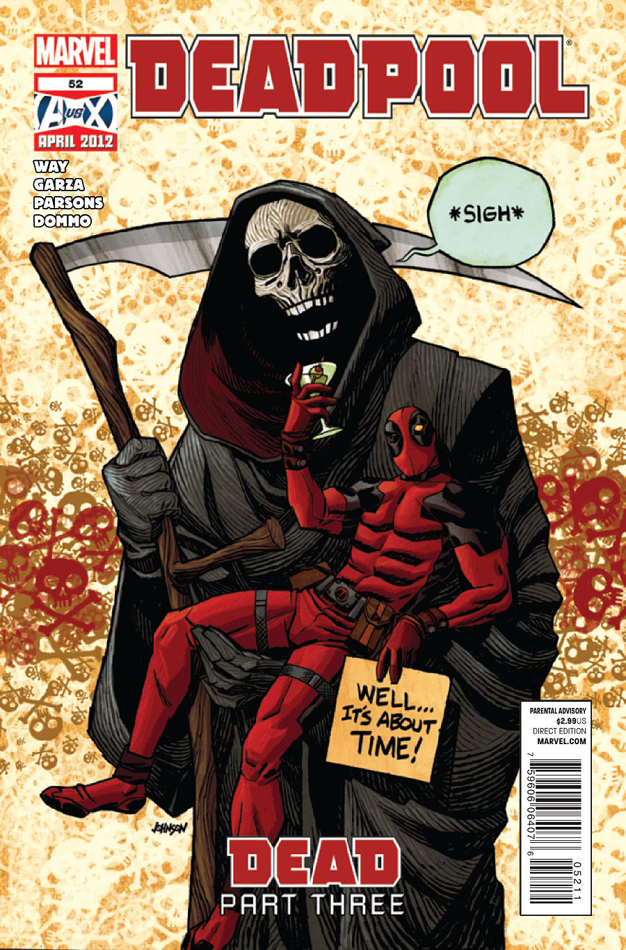
10.
Like I said, Deadpool and Death: best friends forever. Firstly, drunken Deadpool is absolutely
delightful whenever he pops up, so having him meet-up with father death himself
is an absolute delight. The whole
situation is thoroughly reminiscent of Bill and Ted in the best way
possible. I especially like the
line work on realizing death; the way he’s created through this flowing pencil
lines and this creepy shrouded skull in the style of Mike Mignola are all very
horror comic-y.
Then, on top of all
that creepy and well-produced evilness, then BOOM: drunken, splayed Deadpool complete
with martini, sign, and an unnervingly outlined crotch area. It’s also charming as all hell that the
background to this is a ton of cartoon skull and crossbones splattered across
the white void. Finally, this cover features a speech balloon, making it the superior
vision of Deadpool and Death hanging out.

9.
Last cover from the ‘Dead’ storyline I swear, this story
just brings out the best in the character. In all honesty, this really is the best interconnection of
serious and comedic elements to spawn from this particular exploration of
Deadpool and symbols of death. The
pose he’s in is a reference to Kali, the Hindu deity of destruction, which I’m
fine with given Deadpool’s whole thing is irreverent mockery of everything
anyone holds sacred. What’s more,
I like the parody idea of that particular pose by having him apply all the
different methods of destruction to himself.
That might seem a tad morbid. Given, again, Deadpool
can’t be hurt, it’s got more in common with Daffy Duck freaking out than
anything else. Finally, his
methods of self destruction range from morbidly realistic to hilarious in that
giant cartoon bomb or the world’s greasiest hamburgers. I’m not exactly sure why Deadpool has
yellow eyes in this cover, but I’m willing to let that slide because this cover
is great.

8.
It’s normally stated that the only way to kill Deadpool is
decapitation. It's not exactly true. He doesn’t grow a new body like Lobo, though his head remains alive after
removal. If you were to sew his head back to his body, he’d come back good as
new. That’s what this
cover is in reference to, making it one of the most reserved and passive covers
about dismemberment and surgery I’ve ever seen.
In all honesty, the sedate nature of Deadpool in this
situation is what really sells this situation. His expression toward the reader is just a mild
perplexity more than anything else, like he’s genuinely confused and concerned
by their decision to chop his head off.
Actually, the dismemberment aspect reminds me of Daffy Duck again, the way he can often remove his bill at will. This is also just a genius way of
fitting your entire character on the cover regardless of how big you want to
make him. In fact, I tend to
wonder if that’s how this cover got started: the artist was tired of shrinking
Deadpool to make him fit on the cover so just chopped his head off to get him
on there.

7.
Even though I don’t showcase them here, there are a lot of
Deadpool covers that run pretty heavily off of pop culture references. The big reason those covers don’t make
it to this list is that most of their references end up pretty dated, and the
“jokes” aren’t funny when the reference isn’t topical. This Alien riff is a major exception as it perfectly captures that
timeless, MAD Magazine style of
comedy cover that tends to be very funny no matter when you look at it.
I really love the visual of Deadpool’s
emblem forced onto the xenomorph egg, especially how irritated he seems
by the whole situation. They even
changed the title colors to match the Alien
motif. Throw
in the exchange between the inter-titles and Deadpool’s speech balloon, and this
is decidedly absurdist in the best way possible.

6.
This cover jumps right back to that Ego cover from #14. The absurdity actively spoofs the sillier elements of the Marvel
universe. Those three
beekeeper-looking guys Deadpool is playing like a kettledrum are AIM
agents. You might remember AIM as
the evil organization from Iron Man 3
that were behind that whole Mandarin situation. In the movies, they ended up looking like military lava
people, but in the comics, they sport lemon yellow beekeeper outfits that look
amazingly ridiculous in the best way imaginable. Fans have always agreed to just not bring up the silliness
of the AIM outfits, so Deadpool bringing it front and center is pretty great and
speaks to his role as an in-universe satirist of his own reality.
I also get a delightful kick out of the speech balloons here
about how this scene doesn’t happen in the comic. A big issue with classic comic covers built around making
the reader stop and say “this is so weird I must read it” was most of the
time the cover didn’t actually portray the events of the comic. This cover is Deadpool mercilessly
mocking that tradition along with the inherent goofiness of the universe in the
most cartoonish way possible.

5.
How much more overtly cartoonish can you get then having
actual tweety birds circling a knocked out person? Seriously, this is the peak of Deadpool as a human cartoon
character within the Marvel universe, but it’s still pretty lovable
regardless. A big part of this is
that I’m a major sucker for covers that do clever things with the titles, so the
idea of the main character actually being crushed under his own logo is
absolutely hysterical to me.
What’s
more, it’s a clever metaphor for Deadpool as a whole: a whack-y
character crushed under the weight of expectations his name brings with
it. There’s become this major
expectation from Deadpool that he’ll be full of overt swearing, sexuality, and
violence, the trifecta of middle school comedy, even though none of that has
ever been a really big part of Deadpool’s comedy shtick. Underneath all the expectations there’s
just a very silly cartoon character looking to do Looney Tunes shtick in a superhero universe. Who knows, either way I dig it.

4.
If you’re new to the Lido Shuffle, consider this a law: apes
on comics sell comics. There was a time in the ‘50s when there was an editorial mandate that once a
month there had to be a comic featuring a gorilla of some kind, and it was
actually backed up by sales data. In any event, gorilla covers still hold a special place for me. Add
in this cover also featured speech balloons, and it was pretty
much always assured a place on this list.
This is a pretty great realization of what Deadpool as a gorilla might look like as far as blending his costume with the design of an ape. Aside from that, what I really like about the cover is the incredulous look on
gorilla-pool’s face. He just seems
so mildly annoyed and uninterested by this situation. It’s a perfect summation
of the character’s nonchalant attitude towards pretty much any major injury or
calamity that might befall him.

3.
This is your brain on Deadpool. I legitimately can’t think of a better visual metaphor for
the intended purpose of Deadpool than him riding a brain and injecting it with
what looks like an atom-bomb/syringe. Actually, here's a fun fact about this cover: if you look under
Deadpool’s shin, the gray matter of the brain spells out “Wade.” That’s a bizarre allusion to an
issue of All-New X-Men that had no
dialogue but the word “sex” was present on every page constructed out of
background materials. I don’t know
why the allusion is being made in this whack-y Deadpool comic, but I’m not one to
question the random free association that goes into making most Deadpool-related media.
Something I haven’t
really touched on here is the way these covers feature block color backgrounds like just a plane white, black, or blue void. I think that set-up actually works for Deadpool as the
covers are more intended to be single-panel comedy comics rather than enticing
previews for what’s inside the comic. The black background accentuates the idea of this taking place in a comedic void where all things are Deadpool.

2.
Not going to lie: this is my favorite Deadpool cover. Yes, I know it’s not overtly funny or
whack-y. It's actually creepy, But damn does it
stick with you. I originally saw
this cover when it came out as part of the dopey and forgotten 2014 event comic
Original Sin, and it became instantly
lodged in my memory. The main
reason it sticks with me is how easy it is to forget that before all the
experiments and craziness and self-aware humor, Wade Wilson was a person with a
life and identity.
Wilson’s life
as a human being is generally glossed over when it comes to his comic
appearances, so having it right front and center here is very chilling. There’s
no where to hide from the eerie truth that someone died to give us the
hyper-active murderer we all love.
What seems to be a pretty clear and creepy indication is Deadpool’s parents are
dead, and the whole “murdered for comedy” angle that tends to make Deadpool
funny ends up terrifyingly inverted. I wouldn’t begrudge anyone for not liking the seriousness of this cover, but I guarantee you aren’t going to forget it any time soon.

1.
As far as I’m concerned, this cover IS Deadpool. Every aspect of this cover serves to
convey the unique niche of comic culture that Deadpool has climbed into and
dominated since the time of his inception. There’s a level of whackiness so domineering it’s borderline
forced. It's an irreverent tone that walks the thin line between playful and
immature; the most cartoon-y violence imaginable punctuated by the most bloody
depictions they can muster and a massive audience of spectators cheering him
on regardless of action.
Some
folks actually didn’t much care for this cover when it first came out but I
really don’t see why; it’s just being honest about who and what Deadpool is
within the Marvel canon. He’s the
guy who beats up zombie presidents in gory fashion while winking to the camera
about how crazy the whole thing is, That is the platonic essence of
Deadpool. Also, props for
resurrecting zombie Lincoln complete with his stove pipe hat. That’s pretty
nifty.
If you liked this article, please like us on Facebook or follow us on Twitter
If you liked this article, please like us on Facebook or follow us on Twitter
No comments:
Post a Comment